Perceptions of UK labour market “resilience” rest partly on continued growth in the payrolled employees series, based on PAYE data. This series, however, is likely to have been boosted by a rise in the proportion of self-employed people included in PAYE.
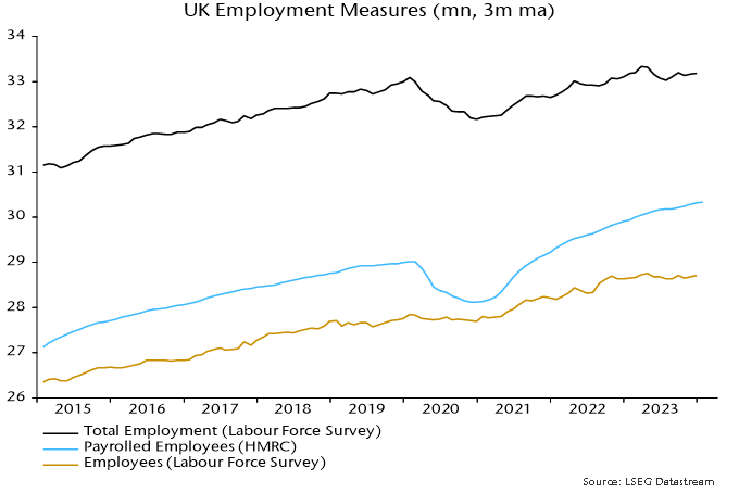
Labour Force Survey (LFS) employment is, at least in concept, the most comprehensive measure of employed people, including all employees and self-employed. The payrolled employees series covers most employees* along with self-employed people who receive pay through PAYE. The latter group includes business owners who choose to draw a salary, contractors on the payroll of the client and self-employed people with second jobs as employees.
LFS employment peaked in the three months to April 2023, standing 150,000 below that level in the three months to January. This is consistent with GDP / gross value added data indicating a recession starting in Q2 2023.
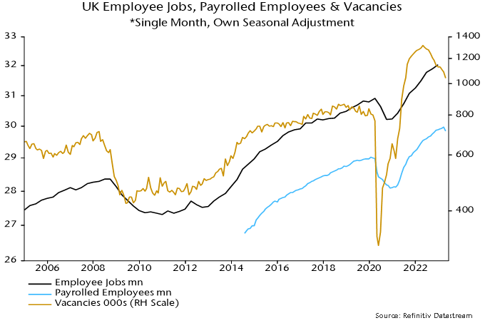
The payrolled employees series, by contrast, grew by 270,000 over the same interval.
This continues a longer-term divergence. LFS employment in the latest three months was 85,000 above its pre-pandemic peak, reached in the three months to February 2020. Payrolled employees have increased by 1.3 million since then – see chart 1.
Chart 1
There are two reasons for suspecting that the payrolled employees series has been swollen by increased PAYE coverage of the self-employed. First, reform of IR35 rules in the private sector in April 2021 are likely to have resulted in some contractors being moved onto clients’ payrolls.
Secondly, the number of employee jobs has risen by more than employee numbers, suggesting a rise in multiple job-holding**. This may have resulted in some people identifying as self-employed in the LFS being picked up in PAYE.
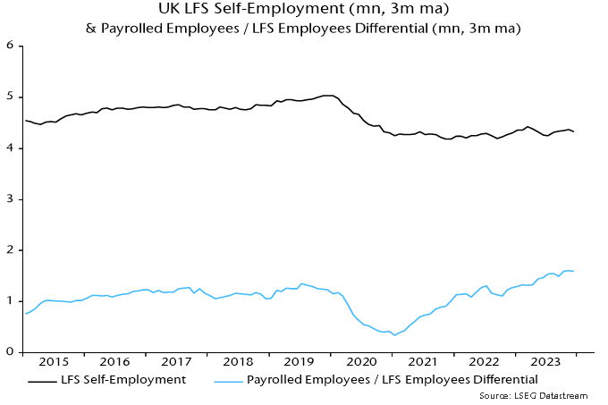
LFS self-employment was 4.33 million in the three months to January. A rough guide to the number included in PAYE is the difference between the payrolled employees series and the LFS measure of employees – 1.6 million.
Chart 2 shows that the latter differential mirrored changes in LFS self-employment until early 2021. It then embarked on a rising trend while LFS self-employment moved sideways. The timing is consistent with an impact from the IR35 reform.
Chart 2
The rise in the payrolled employees / LFS employees differential is unlikely to be solely attributable to increased PAYE coverage of the self-employed. The decline in quality of LFS data due to a falling response rate may have been associated with underrecording of growth in employee numbers.
The payrolled employees series, nevertheless, warrants a health warning and its relative strength should be at least partly discounted, particularly as it jars with other evidence including an ongoing fall in vacancies, rising claimant unemployment, weak REC jobs reports and a recent increase in redundancies.
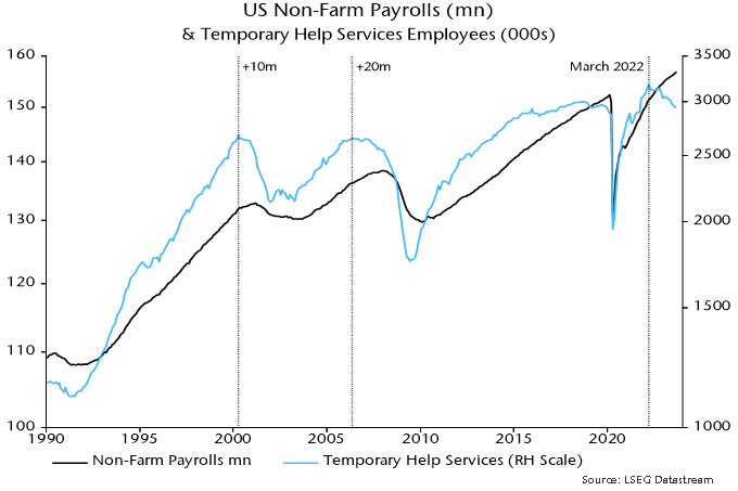
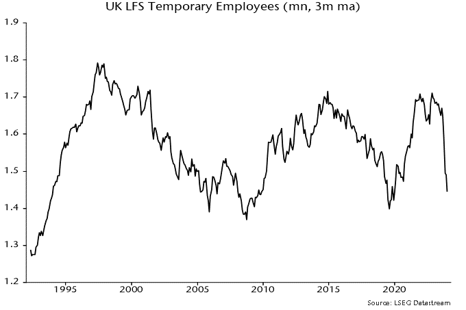
Addendum: Falling US temporary help services employment has been a harbinger of weakness in aggregate payrolls historically. UK LFS temporary employment has a patchier record as a leading indicator but a plunge since the summer is eye-catching – chart 3.
Chart 3
*It does not include employees of companies paying below the national insurance lower earnings limit.
**The Workforce Jobs dataset shows a rise in employee jobs of 1.79 million between Q4 2019 and Q4 2023 versus a 955,000 increase in the LFS measure of employee numbers over the same period.