Chinese May money numbers were weak even allowing for a distortion from a recent regulatory change.

The preferred narrow and broad aggregates here are “true M1” (which corrects the official M1 measure for the omission of household demand deposits) and “M2ex” (i.e. M2 excluding bank deposits held by other financial institutions – such deposits are volatile and less informative about economic prospects).

Six-month rates of change of these measures fell to record lows in May – see chart 1.

Chart 1

Chart 1 showing China Nominal GDP & Narrow / Broad Money (% 6m)

April / May numbers, however, have been distorted by a clampdown on the practice of banks making supplementary interest payments to circumvent regulatory ceilings on deposit rates. This appears to have triggered a large-scale outflow from corporate demand deposits.

The April / May drop in six-month narrow money momentum into negative territory was entirely due to a plunge in demand deposits of non-financial enterprises (NFEs), with household and public sector components little changed – chart 2.

Chart 2

Chart 2 showing China True M1 Breakdown (% 6m)

Where has the money gone? The answer appears to be into time deposits (included in M2ex) and wealth management products (WMPs), with a small portion used to repay debt.

NFE demand deposits contracted by RMB3.82 trillion in April / May combined. Their time and other deposits grew by RMB1.14 trillion over the same period. Total sales of WMPs with a term of six months or less, meanwhile, were unusually large, at RMB2.60 trillion, according to data compiled by CICC.

It has been suggested that banks were paying supplementary interest to meet lending targets – the additional payments gave NFEs an incentive to draw down credit lines while leaving funds on deposit at the lending bank (“fund idling” or “roundtripping” in UK parlance). Repayments of short-term corporate loans, however, were a relatively modest RMB0.53 trillion in April / May.

The appropriate response to regulatory or other distortions to monetary aggregates is to focus on a broadly-defined measure that captures shifts between different forms of money.

Chart 3 includes the six-month rate of change of an expanded M2ex measure including short-maturity WMPs. While momentum is stronger than for M2ex – and not quite at a record low – a decline since December 2023 continued in April / May, suggesting still-deteriorating economic prospects.

Chart 3

Chart 3 showing China Narrow / Broad Money with Adjustment for WMPs (% 6m)

The Bank of Japan’s attempt to withdraw policy accommodation is understandable but misguided. Monetary weakness suggests that the economy is on course to return to deflation.

The BoJ’s difficulties stem from the inflationary policy mistake of the Fed and other G7 central banks in 2020-21. Subsequent tightening to correct this error works partly by boosting currencies to export inflation to – and import disinflation from – countries with responsible policy-making, including Japan.

What about Japan’s home-grown inflation? This was minor and is fading fast. Annual broad money growth peaked in 2020-21 at 8.1% in Japan versus 24.5%, 12.5% and 16.0% in the US, Eurozone and UK respectively. Japanese growth was back at its pre-pandemic (i.e. 2010-19) average by end-2022.

A bumper 5.08% pay award in the spring Shunto is an echo of an inflation pick-up driven mainly by a weakening yen. Most workers are non-unionised / employed by SMEs and will receive smaller increases. Falling inflation, slowing profits and a softening labour market suggest a much lower award next year.

The latest money numbers are ominous. Broad money M3 fell by 0.1% in both April and May, following the BoJ’s removal of negative rates in March. May weakness was driven by f/x intervention– record yen-buying of ¥9.8 trillion last month equates to 0.6% of M3.

Annual M3 growth slumped to 1.3% in May, the lowest since the GFC and half the 2010-19 average, suggesting a fall in annual nominal GDP growth below its respective average of 1.2% – see chart 1.

Chart 1

Chart 1 showing Japan Nominal GDP & Narrow / Broad Money (% yoy)

The BoJ, meanwhile, had moved towards QT before the June MPC announcement of a reduction in JGB purchases from July, with gross buying in May well below the run-rate of redemptions – chart 2.

Chart 2

Chart 2 showing Japan BoJ JGB Purchases (¥ trn)

Monetary weakness contrasts with respectable bank lending expansion – commercial bank loans and leases rose by an annual 3.0% in May. The contribution to money growth, however, has been offset by a combination of increased non-deposit funding, reduced BoJ JGB buying and, in May, a fall in net external assets due to f/x intervention – chart 3*.

Chart 3

Chart 3 showing Japan M3 & Credit Counterparts Contributions to M3 % yoy

What should the BoJ do? A monetarist purist would argue for reversing policy tightening and accepting the currency consequences. Likely further yen weakness, however, would prolong current high inflation – a significant cost to balance against the benefit of avoiding a medium-term return to deflation.

The least bad option may be to signal tightening but delay meaningful action in the hope that a dovish Fed shift will lift pressure off the currency soon. This could be a reasonable description of the BoJ’s recent behaviour.

*Note: the counterparts analysis is available through April.

Previous posts suggested that a recovery in US money growth would stall in Q2 / Q3 as Fed QT was no longer offset by monetary deficit financing (at least temporarily).

The broad M2+ measure – which adds large time deposits at commercial banks and institutional money funds to published M2 – fell by 0.1% in April, with available weekly data suggesting marginal growth in May.

Unexpectedly, however, the narrow M1A measure tracked here – comprising currency in circulation and demand deposits – rose by a bumper 1.8% in April. This follows a 1.3% gain in March – see chart 1.

Chart 1

Chart 1 showing US Broad / Narrow Money (% mom)

Positive narrow money divergence typically occurs when rates are falling. Lower rates encourage a shift of money holdings from time deposits and savings accounts to demand deposits and cash. Such a shift is usually a signal of rising spending intentions.

Are money-holders front-running rate cuts? The narrow money pick-up is a hopeful signal but there is a risk that it goes into reverse if the Fed continues to delay.

The impact of the US April rise on the global aggregate calculated here was offset by a large monthly drop in Chinese narrow money, as measured by “true M1”, which corrects for the omission of household demand deposits from official M1.

So the six-month rate of change of global real narrow money was little changed in April, following a move back into positive territory in March – see prior post for more discussion.

US six-month momentum moved to the top of the ranking across major economies in April, while China returned to negative territory – chart 2.

Chart 2

Chart 2 showing Real Narrow Money (% 6m)

Falling interest rates suggest that the Chinese relapse will prove temporary – chart 3 – but the signal for near-term economic prospects is negative.

Chart 3

Chart 3 showing China Narrow Money (% 6m) & 2y Government Bond Yield (6m change, inverted)

Eurozone / UK real narrow money momentum continued to recover in April but remains negative. The current UK lead may prove temporary unless the MPC follows the ECB in cutting rates soon.

The Chinese relapse resulted in E7 real money momentum falling back in April, while G7 momentum crossed into positive territory – chart 4.

Chart 4

Chart 4 showing G7 + E7 Real Narrow Money (% 6m)

The still-positive E7 / G7 gap coupled with a recent cross-over of global six-month real narrow money momentum above industrial output momentum could signal improving prospects for EM equities. The MSCI EM index outperformed MSCI World by 10.5% pa on average historically under these conditions.

G7 annual broad money growth recovered further in April but, at 2.8%, remains well below a 2015-19 average of 4.5% – chart 5.

Chart 5

Chart 5 showing G7 Consumer Prices & Broad Money (% yoy)

The roughly two-year leading relationship suggests that annual inflation will bottom out in H1 2025 but remain at a low level into H1 2026.

Global (i.e., G7 plus E7) six-month real narrow money momentum returned to positive territory in March, consolidating in April. It has also crossed above six-month industrial output momentum, turning one measure of global “excess” money positive – see chart 1.

Chart 1

Chart 1 showing G7 + E7 Industrial Output & Real Narrow Money (% 6m)

Should investors, therefore, adopt a positive view of economic and market prospects? The judgement here is no – or at least, not yet.

Six-month real narrow money momentum bottomed in September 2023 and lows have preceded those in industrial output momentum by between four and 14 months so far this century. This suggests that a recent decline in output momentum will bottom out by December.

The lag may be at the top end of the range on this occasion, for three reasons.

First, lags tend to be longer when real money momentum reaches extremes, and the September reading was the weakest since 1980.

Secondly, the real money stock is below its long-run trend relationship with industrial output – chart 2. A prior overshoot cushioned the impact of a negative rate of change in 2022-23; the reverse effect could apply in 2024-25.

Chart 2

Chart 2 showing Ratio of G7 + E7 Real Narrow Money to Industrial Output* & 1995-2019 Log-Linear Trend *Index, June 1995 = 1.0

Thirdly, prior recoveries in real money momentum from negative to positive were followed by a recovery in output momentum always in the context of a positively-sloped yield curve (10-year government bond yield minus three-month money rate) – chart 3. The curve is still inverted.

Chart 3

Chart 3 showing Global* Industrial Output (% 6m), Real Narrow Money (% 6m) & Yield Curve *G7 + E7 from 2005, G7 before

The recovery in real narrow money momentum is a hopeful signal for H1 2025 but there remains a risk of surprisingly negative economic data over the next six months. A pessimistic bias will be maintained until real money momentum returns to its long-run average and the yield curve disinverts.

The cross-over of real money momentum above industrial output momentum is similarly judged to be a necessary but not sufficient condition to adopt a positive view of market prospects.

Global equities have outperformed cash on average historically only when a positive real money / industrial output momentum gap partly reflected above-average real money expansion (measured as a 12-month rate of change). The latter condition is unlikely to fall into place before late 2024 at the earliest.

The current combination was associated with mixed equity market performance with some notably bad periods, e.g. mid-2001 and late 2008 / early 2009 – chart 4.

Chart 4

Chart 4 showing MSCI World Cumulative Return vs USD Cash & Global “Excess” Money Measures

The MPC’s forecast in November was that annual CPI inflation would average 3.5% in Q2 2024 (November 2023 Monetary Policy Report (MPR), modal forecast assuming unchanged 5.25% rates). April’s drop to 2.3%, therefore, might be considered cause for celebration.

The negative market response reflected stronger-than-expected services price inflation, with the Bank of England’s “supercore” index rising by an annual 5.7%, a disappointingly small drop from 5.8% in March. This measure strips out “volatile and idiosyncratic” components, namely rents, package holidays, education and air fares.

The MPC has encouraged a focus on services inflation, citing it as one of three key gauges of “domestic inflationary persistence”, along with labour market tightness and wage growth. This prioritisation, however, is questionable, as there is no evidence that supercore leads other inflation components, whereas those components appear to contain leading information for supercore.

Chart 1 shows annual rates of change of three CPI sub-indices: supercore services (34% weight); other components of the core CPI index, i.e. core goods and non-supercore services (43%); and energy, food, alcohol and tobacco (22%).

Chart 1

Chart 1 showing UK Consumer Prices (% yoy)

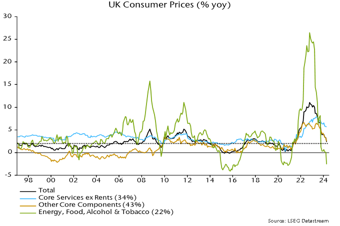
Correlation analysis of this history suggests that supercore follows the other two series: correlation coefficients are maximised by applying a five-month lag on the other core components measure and a four-month lag on energy / food inflation.

Granger-causality tests show that inflation rates of the other core components sub-index and energy / food are individually significant for forecasting supercore. By contrast, supercore terms are insignificant in forecasting equations for the other two sub-indices*.

These results admittedly are strongly influenced by post-2019 data: supercore lagged the inflation upswing and peaked later than the other components.

A notable finding is that supercore inflation has been more sensitive to changes in energy / food prices that the rest of the core index, conflicting with the notion that it is a purer gauge of domestic inflationary pressure. This is partly explained by the one-third weight of catering services in the supercore basket: the associated price index is strongly correlated with food prices.

A forecasting equation for supercore including both other sub-indices predicts a fall in annual inflation to 4.7% in July.

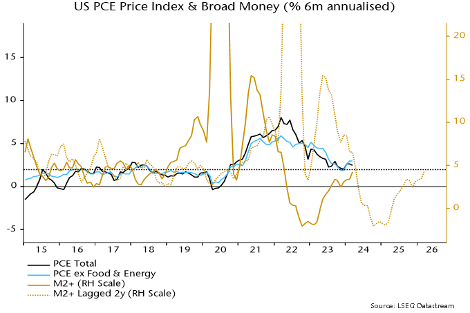
The latest MPR claims that monetary trends are of limited use for inflation forecasting over policy-relevant horizons. Lagged terms in broad money growth, however, are significant when added to the above forecasting equation. The July prediction is lowered to 4.5% with this addition.

A fall in annual supercore inflation to 4.7% in July would imply a dramatic slowdown in the three-month annualised rate of change (own seasonal adjustment), from over 6% in April to below 3%.

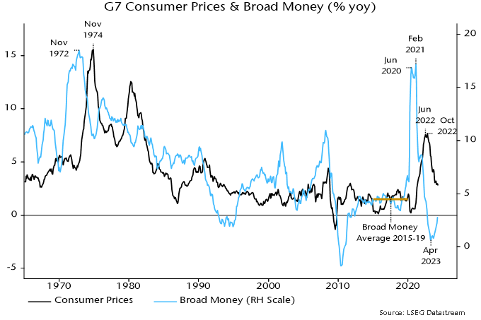
A “monetarist” view is that aggregate inflation trends reflect prior monetary conditions, with the distribution among components determined by relative demand / supply considerations. From this perspective, supercore strength is partly the counterpart of weakness in the other sub-indices. Headline CPI momentum continues to track the profile of broad money growth two years ago, a relationship suggesting a further easing of aggregate inflationary pressure into H1 2025 – chart 2.

Chart 2

Chart 2 showing UK Consumer Prices & Broad Money (% 6m annualised)

*The regressions are based on 12-month rates of change and include lags 3, 6, 9 and 12 of the dependent and independent variables.

USD sales by monetary authorities in Japan, China and other Far East economies have probably topped $100 billion since April, exceeding intervention around the October 2022 dollar peak.

Market estimates are that JPY purchases / USD sales by the Bank of Japan on behalf of the Ministry of Finance on 29 April and 1 May totalled about ¥9 trillion / $ 57 billion. Official numbers covering the period from 26 April will be released next week.

Previous record monthly JPY purchases of ¥6.35 trn in October 2022 were associated with a USDJPY decline of 11.5% from October through January 2023 (month average data) – see chart 1.

Chart 1

Chart 1 showing USDJPY & MoF USD Intervention (¥ trn)

Chinese intervention is best measured by the sum of net foreign exchange settlement by banks and the change in their net forward position, since currency support operations are often conducted via state-owned financial institutions rather than by the PBoC using official reserves (h/t Brad Setser).

This series suggests USD sales of $53 billion in April, the largest since December 2016. Increased pressure for currency support had been signalled by a blow-out in the forward discount on the offshore RMB – chart 2.

Chart 2

Chart 2 showing China Net F/x Settlement by Banks Adjusted for Forwards ($ bn) & Forward Premium / Discount on Offshore RMB (%)

The Bank of Korea may have sold about $5 billion in April, judging from the change in value of reserves. With other Far East authorities also intervening, total USD sales may have exceeded $115 billion.

Intervention is more likely to be effective when supported by shifts in “fundamentals”.

The Bank of Japan’s real effective rate index, based on consumer prices, is at its lowest level since the late 1960s – chart 3*.

Chart 3

Chart 3 showing Japan Real Effective Exchange Rate Based on Consumer Prices, 2020 = 100, Source: Bank of Japan

The USDJPY exchange rate has been tracking the 10-year US / Japan government yield spread but there was a negative divergence at the most recent dollar high – chart 4.

Chart 4

Chart 4 showing USDJPY & 10y Treasury / JGB Yield Spread

Major USDJPY turning points historically were usually preceded by a reversal in the US / Japan relative trade position, which peaked around a year ago – chart 5.

Chart 5

Chart 5 showing USDJPY & US minus Japan Trade Balance as % of GDP (4q ma)

Trade deficits have narrowed in both countries but Japan’s improvement has been sharper, reflecting greater sensitivity to lower energy costs.

US futures data show that speculators (i.e. non-commercials) have been (correctly) long the dollar since March 2021, i.e. for three years and two months. The record unbroken long position occurred between 2012 and 2016, lasting three years and three months before a major reversal – chart 6.

Chart 6

Chart 6 showing USDJPY & Speculative Futures Position* *Net Long as % of Open Interest

The Fed’s real dollar index against advanced foreign economies peaked in October 2022 at a 29% deviation from its long-run average, within the range at secular tops in August 1969, March 1985 and February 2002 – chart 7**. Those peaks occurred six to seven years before lows in the 18-year (average length) housing cycle. The dollar trended lower into and beyond those cycle troughs. Assuming a normal cycle length, another such low is scheduled for the late 2020s.

Chart 7

Chart 7 showing Real US Dollar Index vs Advanced Foreign Economies Based on Consumer Prices, January 2006 = 100, Source: Federal Reserve

*The BoJ index starts in 1970; earlier numbers were estimated using data on the nominal effective rate and Japanese / G7 consumer prices.

**The Fed index starts in 1973; earlier numbers were estimated using data on the nominal effective rate and US / G7 consumer prices.

“Gangbusters” UK GDP growth of 0.6% in Q1 may partly reflect inadequate adjustments for the leap year and early timing of Easter. In any case, the bigger story in recent national accounts data is nominal deceleration.

Nominal GDP rose at an annualised rate of 2.1% in Q4 and Q1 combined, down from 6.3% in the prior two quarters. With output momentum recovering slightly, the slowdown reflected a sharp fall in the rate of increase of the GDP deflator, from 6.6% annualised to 1.5% – see chart 1.

Chart 1

Chart 1 showing UK Nominal & Real GDP (% 2q annualised)

The drop in two-quarter nominal GDP momentum was signalled roughly a year ahead by falls in six-month broad and narrow money momentum into negative territory – chart 2. Money momentum has recovered since Q3 2023 but on both measures remains weaker than during the 2010s, when the GDP deflator rose at an average 1.8% pace.

Chart 2

Chart 2 showing UK Nominal GDP & Narrow / Broad Money (% 2q & % 6m annualised)

As an aside, the latest Monetary Policy Report contains a lengthy discussion of monetary developments and their relevance for policy. The strategy, as usual, is to damn with faint praise. While “broad money growth and inflation appear to have moved together over long cycles … it is harder to take an unambiguous signal about inflationary pressures from growth in the aggregate money data in isolation over shorter, policy-relevant, horizons.”

Really? Study chart 2. A directional leading relationship in rates of change is obvious. Except around the initial Covid lockdown, there are no examples of money momentum giving a seriously misleading message about future nominal GDP developments. As well as signalling the 2021-22 inflation surge, money trends warned of economic weakness / falling price pressures in 2008-09 and 2011-12, while contradicting recession forecasts following the Brexit referendum result. “Monetarists” were on the right side of the policy debate on all these occasions.

The income analysis of GDP allows movements in the GDP deflator to be attributed to changes in labour costs and broadly defined profits per unit of output. How has the recent sharp slowdown been achieved given supposedly sticky wage pressures?

According to the national accounts numbers, employee compensation per unit of output rose at an annualised rate of 1.8% in Q4 / Q1, down from 6.9% in the prior two quarters – chart 3. This slowdown is consistent with official earnings data and reflects a combination of 1) a moderation in regular earnings momentum, 2) a fall in bonus payments and 3) a pick-up in productivity (i.e. output per worker) as employment fell.

Chart 3

Chart 3 showing UK GDP Deflator & Income Components (% 2q annualised)

Profits and other “entrepreneurial” income per unit of output, meanwhile rose by only 1.1% annualised in the latest two quarters, versus 6.3% in Q2 / Q3 2023.

Domestic cost developments, therefore, are compatible with the inflation target while money growth, although recovering, remains too low. The “monetarist” view is that the MPC is behind the curve – again.

post in February argued that US Treasury plans to reduce reliance on bills to fund the deficit implied weaker monetary expansion from Q2, with possible negative implications for markets and economic prospects. This scenario remains on track.

The Treasury last week confirmed a reduction in the stock of Treasury bills in Q2 while signalling small-scale issuance in Q3.

Deficit financing via bills rather than coupon debt tends to boost the broad money stock because bills are mostly bought by money-creating institutions, i.e. banks and money funds. Their purchases are usually associated with expansion of their balance sheets, with a corresponding increase in monetary liabilities.

Broad money also tends to rise when the Treasury finances the deficit by running down its cash balance at the Fed.

Both effects were in play in 2023 / early 2024, resulting in a large monetary boost from Treasury operations that more than offset the Fed’s QT – see chart 1.

Chart 1

Chart 1 showing US Broad Money M2+ (6m change, $ bn) & Fed / Treasury QE / QT (6m sum, $ bn)

The latest Treasury estimates, however, imply a small negative impact in Q2 / Q3 combined. The earlier post argued that the Fed would need to halt QT to offset this shift. Last week’s taper announcement was insufficient, implying that the combined Treasury / Fed influence is likely to turn significantly contractionary – chart 2.

Chart 2

Chart 2 showing US Broad Money M2+ (6m change, $ bn) & Sum of Fed & Treasury QE / QT (6m sum, $ bn)

Will a revival in bank lending neutralise the Treasury / Fed drag? The Fed’s April senior loan officer survey was less negative but demand and supply balances remain soft by historical standards, arguing against a strong pick-up – chart 3.

Chart 3

Chart 3 showing US Commercial Bank Loans & Leases (% 6m annualised) & Fed Senior Loan Officer Survey Credit Demand & Supply Indicators* *Weighted Average of Balances across Loan Categories

April monetary statistics will be released in late May but weekly numbers on currency, commercial bank deposits and money funds are consistent with emerging weakness  – chart 4.

Chart 4

Chart 4 showing US Broad Money M2+ & Weekly Proxy* ($ trn) *Currency in Circulation + Commercial Bank Deposits + Money Funds

The Fed’s preferred core price measure – the PCE price index excluding food and energy – rose by an average 0.36% per month, equivalent to 4.4% annualised, over January-March.

The FOMC median projection in March was for annual core inflation to fall to 2.6% in Q4 2024. This would require the monthly index rise to step down to an average 0.17% over the remainder of the year – see chart 1.

Chart 1

Chart 1 showing US PCE Price Index ex Food & Energy

The judgement here is that such a slowdown is achievable and could be exceeded, based on the following considerations.

First, such performance was bettered in H2 2023, when the monthly rise averaged 0.155%, or 1.9% annualised, i.e. the requirement is within the range of recent experience.

Secondly, the monetarist rule of thumb of a two-year lead from money to prices suggests a strong disinflationary impulse during H2 2024. From this perspective, any current “stickiness” may reflect the after-effects of a second pick-up in six-month broad money momentum in 2021, following the initial surge into mid-2020– see chart 2.

Chart 2

Chart 2 showing US PCE Price Index & Broad Money (% 6m annualised)

Momentum returned to a target-consistent 4-5% annualised in April 2022, subsequently turning negative and recovering only from March 2023, with the latest reading still sub-5%. Allowing for the usual lag, the suggestion is that six-month price momentum will move below 2% in H2 2024, remaining weak through next year.

A third potential favourable influence is a speeding-up of the transmission of recent slower growth of timely measures of market rents to the PCE housing component. Six-month momentum of the latter was still up at 5.6% annualised in March but weakness in the BLS new tenant rent index through 2023 is consistent with a return to the pre-pandemic (i.e. 2015-19) average of 3.4% or lower – chart 3. With a weight of 17.5%, such a decline would subtract 3 bp from the monthly core PCE change.

Chart 3

Chart 3 showing US PCE Price Index for Housing (% 6m annualised) & BLS Tenant Rent Indices (4q ma, % 6m annualised)

UK house prices were an estimated 52% expensive relative to history at the end of 2023, based on a comparison with rents and the real yield on index-linked gilts, a competing inflation-protected asset.

The degree of overvaluation is below previous extremes and does not imply that house prices need to fall by an equivalent magnitude, or even at all – the deviation could be eliminated by rental growth and a reversal of the recent rise in real yields.

The ratio of the average house price to average earnings is conventionally used to assess valuation. Chart 1 shows an economy-wide version of this ratio – the estimated value of the housing stock divided by aggregate household disposable income.

Chart 1

Chart 1 showing Ratio of UK House Prices to Household Income* *Value of Housing Stock Divided by Gross Disposable Income of Households

The secular rise in the ratio is usually ascribed to such factors as increasing credit availability, population growth and undersupply due to planning and other constraints.

The use of earnings as a yardstick is questionable: it would be odd to assess the valuation of an equity market by reference to the income of investors. A better approach is to compare house prices with the value of services provided – proxied by rents – using an appropriate discount rate.

A simple valuation metric based on this approach is the gap between the rental yield on housing and the real yield on longer-term index-linked gilts. Index-linked rather than conventional bonds are the appropriate reference because housing is expected to provide inflation protection over the longer term.

The rental yield series, shown in chart 2, is derived from national accounts data by dividing the sum of actual and imputed rents by an estimate of the value of the housing stock*. The measure, therefore, is comprehensive, including owner-occupied and public housing as well as private rented accommodation.

Chart 2

Chart 2 showing UK Housing Rental Yield & 5y+ Index-Linked Gilt Yield

The index-linked yield series starts in 1983 – the first such gilt was issued in 1981 – so the rental / index-linked yield gap has 41 years of history. In contrast to the house price to income ratio, the gap appears to be stationary / mean-reverting. The average (mean) gap over this period was 4.96 pp. The deviation from this average is the basis of the estimate of over- / undervaluation in a particular year.

The gap indicates that housing was undervalued as recently as in 2021 but only because index-linked yields had fallen to a record negative.

The drop in the yield gap to an estimated 3.27% at end-2023 – implying housing overvaluation of 52% – was driven by index-linked yields returning to positive territory. The rental yield was little changed between 2021 and 2023.

Current overvaluation compares with prior extremes of 74% in 2007 and 105% in 1988 – chart 3. These extremes marked peaks of the 18-year housing cycle, with another top due around 2025.

Chart 3

Chart 3 showing Ratio of UK House Prices to Implied Fair Value* *Based on Rental Yield / Index-Linked Yield Gap

The suggestion is that, unless index-linked yields revert to negative, housing will perform poorly relative to history over the longer term, although prices may be supported over the next 1-2 years as the housing cycle upswing crests.

*The current series for actual and imputed rents begin in 1985; earlier numbers were estimated by linking to previous vintages. The value of the housing stock was calculated by adding the value of dwellings and an estimate of the value of associated land. The latter estimate was derived by applying the ratio of land value to dwellings value for households to the value of dwellings owned by all sectors. The resulting series begins in 1995; earlier numbers were estimated by linking to a previous vintage series for the value of the residential housing stock including land.