Global six-month real narrow money momentum is estimated to have moved sideways for a fourth month in July at a weak level by historical standards – see chart 1.

Chart 1

Chart 1 showing Global Manufacturing PMI New Orders & G7 + E7 Real Narrow Money (% 6m)

The baseline scenario here remains that global economic momentum – proxied by the global manufacturing PMI new orders index – will move down into late 2024, echoing a fall in real money momentum into September last year. Based on more recent monetary data, a subsequent recovery may prove limited, with weakness persisting well into H1 2025.

The unchanged July global real money momentum reading conceals a rise in the US offset by further weakness in China. The E7 ex. China component also cooled, while G7 ex. US momentum remained negative, moving sideways – chart 2.

Chart 2

Chart 2 showing Real Narrow Money (% 6m)

The Chinese series incorporates an adjustment* for a recent portfolio shift by non-financial enterprises from demand to time deposits in response to a regulatory change (a clampdown on payment of supplementary interest by banks). Chinese momentum would be significantly more negative without this adjustment, while the global series would be at its weakest level since February. (The adjustment may, however, underestimate the negative distortion to Chinese narrow money.)

Chart 3 shows additional DM detail. Real narrow money momentum is relatively strong in Canada and Australia as well as the US.

Chart 3

Chart 3 showing Real Narrow Money (% 6m)

Japan moved deeper into negative territory but recent weakness partly reflects f/x intervention, so may abate.

Real money momentum is higher in the UK than the Eurozone but the difference is small, with both still negative. Recent UK economic outperformance is unlikely to last.

The pick-up in US real narrow money momentum suggests improving economic prospects but confirmation is required and lags should be respected.

The US July reading was boosted by a favourable base effect – narrow money contracted by 0.6% month-on-month in January. The base effect remains favourable for August but turns significantly negative in September / October.

Six-month growth of US broad money is weaker than for narrow and has edged lower since May, though hasn’t yet fallen to the extent suggested by a contractionary shift in the joint influence of Treasury financing operations and Fed QT, discussed previously. The latest Treasury financing projections imply that this influence will turn expansionary again in Q4.

For perspective, US six-month real narrow money momentum had recovered to the current level in September 2008 as the financial crisis was reaching a crescendo with the recession having nine more months to run. In the prior 2001 recession, the current level was reached three months before the economy hit bottom. In both cases, the NBER business cycle dating committee had yet to determine that a recession had begun.

*The adjustment assumes that the share of demand deposits in total bank deposits of non-financial enterprises would have been stable at its March level in the absence of the regulatory change. The adjustment does not take into account any shift from bank deposits to non-monetary instruments (e.g. wealth management products) or effects on other money-holders.

The assessment here remains that the global economy has entered a “double dip” currently focused on manufacturing but likely to extend to services / labour markets, reigniting worries about a hard landing. Economic weakness is expected to be accompanied by an inflation undershoot into H1 2025.

DM flash manufacturing PMI results for August were mixed across countries but on balance weak, suggesting a further small reduction in global manufacturing PMI new orders following a July plunge to below 50 (assuming no change for China and other non-flash countries) – see chart 1.

Chart 1

Chart 1 showing Global Manufacturing PMI New Orders & G7 + E7 Real Narrow Money (% 6m)

Services results were again much stronger than for manufacturing but there are hints of emerging weakness in a fall in output expectations since May and a drop in US / Eurozone employment indices to below 50 this month.

A previous post suggested that the OECD’s US composite leading indicator has reversed lower since publication of the last official data point, for June. An update based on partial data points to a further decline in August – chart 2. The OECD will release July / August data for its indicators on 5 September.

Chart 2

Chart 2 showing OECD US Leading Indicator* *Relative to Trend

The OECD’s Chinese leading indicator has been falling since late 2023 and the decline is estimated to have continued in July / August – chart 3.

Chart 3

Chart 3 showing OECD China Leading Indicator* *Relative to Trend

Weaker economic momentum and pricing power are feeding through to company earnings. Revisions ratios have turned down since April in the US, Eurozone and UK, with the August Eurozone reading the weakest since 2020 – chart 4.

Chart 4

Chart 4 showing Earnings Revisions Ratios (MSCI / IBES, sa)

By MSCI World sector, August revisions ratios were most negative in consumer discretionary followed by energy, consumer staples and materials. The ratios for consumer discretionary and staples were the weakest since 2020, suggesting that a fall-off in consumer demand has been a key driver of the renewed downturn in manufacturing – chart 5.

Chart 5

Chart 5 showing Global Manufacturing PMI New Orders & MSCI World Consumer Discretionary / Staples Earnings Revisions Ratios

This week’s announcement by the BLS of a preliminary 818,000 or 0.5% downward revision to the March 2024 level of non-farm payrolls, meanwhile, raises the possibility that US employment has already stalled.

The revision is based on the comprehensive Quarterly Census of Employment and Wages (QCEW). A monthly QCEW employment series is available through March but is not seasonally adjusted. Chart 6 compares the monthly change in non-farm payrolls, as currently reported before incorporating the revision, with the change in a seasonally-adjusted version of the QCEW measure.

Chart 6

Chart 6 showing US Employment Measures (mom change, 000s)

The increase in non-farm payrolls was 133k per month higher than growth of the seasonally-adjusted QCEW series during Q1. If overstatement of this magnitude has continued since Q1, reported growth of 108k and 114k in non-farm payrolls in April and July could imply small declines in “true” employment in those months.

The most important issue in the global economic outlook is the meaning of Chinese monetary weakness.

Six-month rates of change of narrow / broad money, bank lending and total social financing (on both new and old definitions*) reached record lows in June / July – see chart 1.

Chart 1

Chart 1 showing China Nominal GDP and Money/Social Financing (% 6months)

Monetary weakness has been entirely focused on the corporate sector: M2 deposits of non-financial enterprises plunged 6.6% (13.6% annualised) in the six months to July (own seasonal adjustment) – chart 2.

Chart 2

Chart 2 showing China M2ex Breakdown (% 6 months)

Recent regulatory changes appear to account for only a small portion of the corporate broad money decline.

A clampdown on banks paying interest above regulatory ceilings has resulted in a shift out of demand deposits but money has largely stayed in the banking system – available data suggest modest inflows to wealth management products and other non-monetary assets.

The clampdown has also discouraged the practice of “fund idling” (round-tripping in UK monetary parlance), whereby banks offered loans to corporate borrowers to meet official lending targets, with borrowers incentivised to hold the funds on deposit.

If an unwinding of such activity accounted for the decline in corporate money, however, short-term bank lending to corporations would be expected to show equivalent weakness. Such lending has continued to grow, albeit at a slower pace recently, as have longer-term loans.

A trend decline in the ratio of corporate M2 deposits to bank borrowing, therefore, has accelerated – chart 3.

Chart 3

Chart 3 showing China Corporate Liquidity Ratio

Household money holdings, by contrast, have been growing solidly – chart 2. An alternative explanation for the corporate money decline is simply that households are still hunkering down as the property crisis deepens, with weakening demand for consumer goods / services and housing transferring income and liquidity from the corporate sector.

The latest PBoC and NBS consumer surveys confirm rock-bottom sentiment – chart 4. If this explanation is correct, corporate money weakness may presage a collapse in profits – chart 5.

Chart 4

Chart 4 showing China Consumer Confidence Measures

Chart 5

Chart 5 showing China INdustrial Profits and M2 Deposits Non-Financial Enterprises (% year over year)

Why hasn’t the PBoC hit the panic button? Policy easing has been constrained by currency weakness: the most comprehensive measure of f/x intervention (h/t Brad Setser) reached $58 billion in July, the highest since 2016 – chart 6. The recent yen rally has offered some relief, reflected in a narrower offshore forward discount, but the authorities may be concerned that this will prove temporary.

Chart 6

Chart 6 showing China Net F/x Settlement Banks Adjusted Forwards ($ billions) and Forward Premium/Discount on Offshore RMB (%)

The strange policy of trying to push longer-term yields higher against a recessionary / deflationary backdrop may represent an attempt to support the currency, rather than being motivated primarily by concern about financial risks. To the extent that the policy results in banks selling bonds, however, the result will be to exacerbate monetary weakness and economic woes.

*The previous definition excludes government bonds so is a measure of credit expansion to the “real economy”.

Will the Bank of Japan’s latest attempt to exit ZIRP prove any more successful than its previous two efforts, in 2000 and 2006?

The monetary backdrop is no more promising. The six-month rate of change of broad money M3 was 0.5% annualised in June compared with 1.3% and -1.1% respectively before the August 2000 and July 2006 rate hikes – see chart 1.

Chart 1

Chart 1 showing Japan Policy Rate Target & Broad Money (% 6m annualised)

Money growth, admittedly, has been depressed by recent record intervention to support the yen. The judgement here is that the authorities have marked out a major low in the currency – see previous post – so f/x sales are likely to slow / end.

A reduced intervention drag, however, will be offset by a contractionary monetary influence from QT. The announced phased reduction in monthly purchases implies that the BoJ’s JGB holdings will fall by about ¥8 trn during H2 2024, equivalent to an annualised 1.0% of M3.

Credit developments are superficially more supportive of policy tightening. The six-month rate of change of commercial banks’ loans and leases was 3.5% annualised in June compared with -1.9% and 2.8% before the 2000 / 2006 hikes.

Bank lending, however, is usually a lagging indicator of economic momentum, suggesting a slowdown ahead in response to recent activity weakness.

The BoJ “will … continue to raise the policy interest rate” if its outlook for economic activity and prices is realised. Headline and core CPI inflation are projected to be close to the 2% target in fiscal years 2025 and 2026 based on the output gap turning positive and a “virtuous cycle between prices and wages continuing to intensify”.

The “monetarist”  forecast, by contrast, is that inflation is heading for a big undershoot. Six-month core CPI momentum was 1.5% annualised in June*, with lagged broad money growth suggesting a further decline into 2025 – chart 2.

Chart 2

Chart 2 showing Japan Consumer Prices & Broad Money (% 6m annualised)

Coming Japanese inflation experience will be another test of forecasting approaches. Simplistic monetarism has trounced new Keynesian orthodoxy so far this decade. Another win for monetarist simpletons will spell third time unlucky for the BoJ.

*Own estimate adjusting for policy effects and seasonals.

Global six-month real narrow money momentum – a key indicator in the forecasting process followed here – is estimated to have moved sideways for a third month in June, based on monetary data covering 85% of the aggregate.

Real money momentum has recovered from a September 2023 low but remains below both its long-run average and the average in the 10 years preceding the GFC, when short-term interest rates were closer to recent levels – see chart 1.

Chart 1

Chart 1 showing G7 + E7 Industrial Output & Real Narrow Money (% 6m)

The expectation here has been that the fall into the September 2023 low would be reflected in a weakening of global industrial momentum into late 2024. DM flash PMI results for July support this forecast, implying a fall in global manufacturing PMI new orders from 50.8 in June to below 50, assuming unchanged readings for China / EM.

Chart 2

Chart 2 showing Global Manufacturing PMI New Orders & G7 + E7 Real Narrow Money (% 6m)

The stalling-out of real money momentum at a weak level suggests that economic expansion will remain sub-par in early 2025.

Global six-month industrial output growth, meanwhile, recovered in April / May, crossing back above real money momentum – chart 3. The implied negative shift in “excess” money conditions may partly explain recent market weakness / rotation.

Chart 3

Chart 3 showing G7 + E7 Industrial Output & Real Narrow Money (% 6m)

Global six-month real narrow money momentum was held back in May / June by weakness in China and Japan, discussed in recent notes. A US slowdown is a risk going forward.

note in February argued that expansionary deficit financing operations – “Treasury QE” – have more than offset the monetary drag from Fed QT. Specifically, the Treasury relied on running down its cash balance at the Fed and issuing Treasury bills to fund the deficit in H2 2022 and 2023. The former represents a direct monetary injection while bill issuance is likely to expand broad money because bills are mostly purchased by money funds and banks. (A recent paper from Hudson Bay Capital makes a similar point, referring to variations in the maturity profile of debt sales as “activist Treasury issuance”.)

The February article and an update in May, however, noted that Treasury financing estimates implied that the six-month running total of Treasury QE would slow sharply in Q2 and turn negative in Q3. With Fed QT continuing, albeit at a slower pace, the joint Treasury / Fed impact on broad money was on course to become significantly contractionary.

Treasury QE has fallen as expected and the joint contribution has become negative – charts 4 and 5. Six-month broad money momentum has yet to slow significantly, although three-month growth in June was the weakest since November. Money momentum lagged when the joint impact swung from negative to positive in late 2022 / early 2023.

Chart 4

Chart 4 showing US Broad Money M2+ (6m change, $ bn) & Fed / Treasury QE / QT (6m sum, $ bn)

Chart 5

Chart 5 showing US Broad Money M2+ (6m change, $ bn) & Sum of Fed & Treasury QE / QT (6m sum, $ bn)

The approach here places greater weight on narrow than broad money for short-term forecasting. A US broad money slowdown, in theory, could be accompanied by stable or stronger narrow money expansion, for example if rising confidence leads to an increase in broad money velocity, with an associated portfolio shift into demand deposits. Such a scenario, however, is less likely the longer the Fed delays significant rate cuts.

The slowdown in Treasury QE explains a reversal lower in US bank reserves since April – chart 6. The prior rise in reserves, despite ongoing Fed balance sheet contraction, occurred because money funds were moving funds out of the overnight reverse repo facility in order to buy newly-issued Treasury bills, with the Treasury reinjecting the cash via the deficit.

Chart 6

Chart 6 showing US Federal Reserve Balance Sheet ($ bn)

Japanese bank reserves are also on course to fall as the BoJ embarks on QT – chart 7. Market speculation is that the MPC will announce a reduction in gross JGB purchases to ¥3 trn per month at next week’s meeting, from an average ¥5.7 trn in H1. With redemptions averaging ¥6.5 trn over the last year, this suggests monthly QT of ¥3.5 trn ($23 bn), equivalent to 2.6% of broad money M3 at an annualised rate.

Chart 7

Chart 7 showing Japan BoJ Balance Sheet (¥ trn)

Chinese money trends are puzzling but ominous, suggesting – at a minimum – that the economy will remain weak through H2.

Q2 real GDP growth came in below expectations but there was better news on the nominal side: two-quarter nominal GDP expansion rose for a second quarter as the GDP deflator stabilised – see chart 1.

Chart 1

Chart 1 showing China Nominal & Real GDP (% 2q annualised)

This improvement tallies with a recovery in six-month rates of change of narrow money and broad credit around end-2023. Money and credit momentum, however, has since slumped, reaching a new record low in June – chart 2.

Chart 2

Chart 2 showing China Nominal GDP & Money / Social Financing (% 6m)

post a month ago noted that money – and to a lesser extent credit – numbers have been distorted by a regulatory clampdown on the practice of banks paying supplementary interest. This has resulted in non-financial enterprises (NFEs) moving money out of demand deposits into time deposits and non-monetary instruments such as wealth management products (WMPs), as well as repaying some debt.

The post suggested discounting narrow money weakness and focusing on an expanded broad money aggregate including WMPs. The six-month rate of change of this measure had slowed significantly but was still within – just – the historical range of six-month broad money growth.

That is no longer the case. CICC numbers on WMPs show an outflow in June. Six-month growth of the expanded measure has converged down towards that of conventional broad money – chart 3.

Chart 3

Chart 3 showing China Narrow / Broad Money with Adjustment for WMPs (% 6m)

F/x intervention to support the yuan has contributed to monetary weakness but the effect has been minor. Net f/x settlement by banks – which captures spot intervention using the balance sheets of state banks and other institutions – amounted to CNY590 bn ($83 bn) or 0.2% of broad money in the six months to May (a June number is due this week).

Household money growth, it should be emphasised, is stable and respectable: broad money weakness is entirely attributable to a loss of NFE deposits – chart 4. The puzzle is the destination of the “missing” NFE money. Only a small portion is likely to have been used to repay debt: banks’ short-term corporate lending fell in April / May but rebounded to a new high in June.

Chart 4

Chart 4 showing China M2ex* Breakdown (% 6m) *M2 ex Financial Institution Deposits

The focus of monetary weakness on NFEs suggests downside risk to investment and hiring, with negative feedback from the latter to consumer spending.

An analysis of the Fed’s historical behaviour suggests that the conditions for policy easing are in place.

Chart 1 shows the fitted values and current prediction of a logit probability model for classifying months according to whether the Fed is in policy-tightening or policy-easing mode.

Chart 1

Chart 1 showing US Fed Funds Rate & Fed Policy Direction Probability Indicator

The model’s determination for a particular month depends on values of annual core PCE inflation, the unemployment rate and the ISM manufacturing delivery delays index known at the end of the first week of the month (i.e. after the release of the employment report for the prior month).

The model can be thought of as an approximation of the Fed’s “average” reaction function over the last 60+ years. It correctly classifies 87% of months over this period, i.e. the estimated probability of being in policy-tightening mode was above 0.5 in tightening months and below 0.5 in easing months.

There is no memory effect – the model ignores whether the Fed was in tightening / easing mode in the previous month, only considering the above data series (with no dummy variables for “shocks”).

The dependent variable takes the value 1 from the month of the first rate increase in a tightening phase until the month before the first cut in a subsequent easing phase, and 0 otherwise. So a rate plateau before an easing is still classified as part of a tightening phase (and a rate floor before the first hike part of an easing phase).

The tightening / easing phases were identified judgementally and are shown by the shaded / unshaded areas in the chart. The Wu-Xia shadow rate informs the dating of phases during zero-rate periods since the GFC.

The model estimates the probability of the Fed being in tightening mode this month (July 2024) at 0.23, the lowest value since September 2021. Equivalently, the probability of a start of an easing phase is 0.77.

A fall in the tightening probability from 0.62 in March reflects a 0.2 pp rise in the unemployment rate over the last four months (from 3.9% to 4.1%) and a 0.3 pp fall in annual core PCE inflation (from 2.9% to 2.6%).

The Fed is unlikely to announce a rate cut at the conclusion of its next meeting on 31 July, as this would be at odds with recent communications (although the probability may be higher than the 0.05 implied by market pricing on 11 July, according to CME FedWatch).

The model’s shift, however, suggests a strong chance of a dovish statement teeing up a September move.

Eurozone money trends remain too weak to support an economic recovery. A relapse in the latest business surveys could mark the start of a “double dip”.

Three-month rates of change of narrow and broad money – as measured by non-financial M1 and M3 – were zero and 3.3% annualised respectively in May. Current readings are well up on a year ago but significantly short of pre-pandemic averages – see chart 1.

Chart 1

Chart 1 showing Eurozone Narrow / Broad Money & Bank Lending (% 3m annualised)

May month-on-month changes were soft, with narrow money contracting by 0.1% and growth of the broad measure slowing to 0.1%.

Six-month real narrow money momentum – the “best” monetary leading indicator of economic direction – moved sideways in May, remaining significantly negative and lower than in other major economies. (The latest UK reading is for April.)

Chart 2

Chart 2 showing Real Narrow Money (% 6m)

June declines in Eurozone PMIs and German Ifo expectations may represent a realignment with negative monetary trends following a temporary overshoot – chart 3. A recent correction in cyclical equity market sectors could extend if Ifo expectations stall at the current level – chart 4.

Chart 3

Chart 3 showing Germany Ifo Manufacturing Business Expectations & Eurozone / Germany Real Narrow Money (% 6m)

Chart 4

Chart 4 showing Germany Ifo Manufacturing Business Expectations & MSCI Europe Cyclical Sectors ex Tech* Price Index Relative to Defensive Sectors *Tech = IT & Communication Services

Growth of bank deposits is similar in France, Germany and Spain but lagging in Italy – chart 5. The country numbers warrant heightened scrutiny, given a risk that French political turmoil triggers deposit flight to Germany.

Chart 5

Chart 5 showing Bank Deposits of Eurozone Residents* (% yoy) *Excluding Central Government

Retro weighing scale on a wooden table.

Institutional investors often grapple with the decision to hedge against currency fluctuations for non-domestic investments. A common concern is that currency exposure will increase the volatility of non-domestic equity returns.

This article explores when hedging is beneficial and when Canadian investors can gain from being unhedged.

Are domestic or global equities more volatile?

There is an assumption that investing outside of Canada, with exposure to various currencies and markets, can result in more volatile returns for global equities compared to Canadian equities. However, over shorter timeframes (rolling three-year returns), global equities have generally been less volatile than Canadian equities, although there have been exceptions.

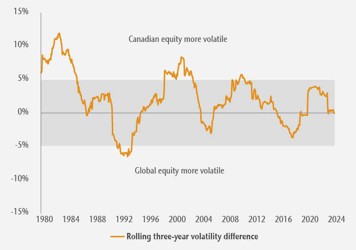
Figure 1: Canadian vs. global equity relative volatility

Line graph comparing rolling 3-year volatility differences between Canadian and Global equities from 1980 to 2024.
Source: Bloomberg and MSCI.

Figure 1 illustrates the relative volatility of returns for Canadian equities (S&P/TSX Composite Index) compared to global equities (MSCI World Index unhedged). When the orange line is above 0%, Canadian equities were more volatile; below 0%, global equities were more volatile. The chart highlights that, over short-term periods, Canadian equities have often been more volatile.

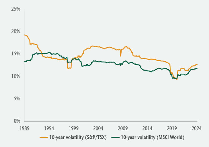
Over longer periods (10-year rolling returns) and since the late 1990s especially, global equities have almost consistently been less volatile than Canadian equities (Figure 2), benefitting from a larger and more diversified universe of investment opportunities.

Figure 2: Canadian vs. global equity absolute return volatility

Line graph comparing absolute return volatility differences between Canadian and global equities from 1989 to 2024.
Source: Bloomberg and MSCI.

Does hedging reduce global equity volatility?

Contrary to the belief that hedging is necessary to reduce volatility, historical data indicates that this is not always true.

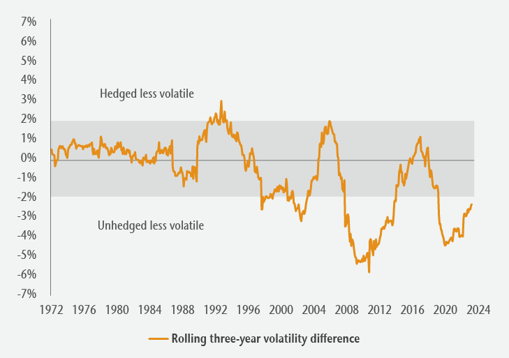
Figure 3 shows the relative volatility of hedged and unhedged global equity returns over rolling three-year periods. When the orange line is above 0%, hedged returns were less volatile; below 0%, unhedged returns were less volatile. Unhedged global equity returns have generally been less volatile, particularly since the mid-1990s, as currency movements tend to counterbalance equity returns for lower overall return volatility.

Figure 3: Hedged vs. unhedged global equities

Line graph comparing rolling 3-year volatility differences between hedged and unhedged global equities from 1972 to 2024.
Source: Bloomberg and MSCI.

What is the optimal currency hedge ratio?

The hedge ratio, the value of the hedge position relative to the total position value, varies by investor. If a portfolio holds $10 million in global equities and $3 million of the currency exposure is hedged, then the hedge ratio is 30%. While research often points to a 50% hedge ratio as optimal, individual decisions depend on specific currency exposure and risk perspectives. Figure 4 shows two investors with different hedging ratios, but the same net currency exposure.

Figure 4: Same net currency exposure, different hedge ratios

Currency exposure (a) Hedge ratio (b) Net currency exposure (a-b)
Investor 1 60% 50% 30%
Investor 2 30% 0% 30%

Source: Bloomberg and MSCI.

From a risk management perspective, a 50% hedge ratio is sometimes used to manage “regret risk,” the potential disappointment of adopting an unhedged or fully hedged approach that later proves suboptimal.

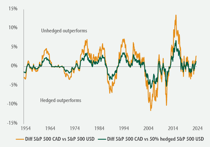
Figure 5 compares the rolling three-year performance differences between unhedged and fully hedged US equity returns (orange line) to those of unhedged and 50% hedged US equity returns (green line). When the lines are above 0%, the unhedged strategy outperformed, while the fully hedged and 50% hedge strategies outperformed when the lines fall below 0%.

Figure 5: US equity rolling 3-year relative performance

Line graph comparing rolling three-year performance differences between unhedged and fully hedged US equity returns and unhedged and 50% hedged US equity returns.
Source: Bloomberg and MSCI.

By design, the return difference for the 50% “regret risk” hedging approach (green line) was less volatile over the period. For some investors, experiencing smaller differences due to currency fluctuations may be preferred.

How should currency be managed in private markets?

There continues to be significant growth in allocations to global private markets, such as direct real estate and infrastructure assets in open-end funds. These less-liquid assets still require careful consideration of currency exposure that can affect their short-term value. Private market investors generally expect income and diversification through absolute returns, which can be materially impacts by currency fluctuation.

Hedging can manage these risks, but an assessment of each investment’s specific factors is necessary. This includes understanding the asset’s underlying revenues and expenses, potential natural hedges, hedging costs and the duration of the hedge. Matching the currency of net exposure with associated financing is also important.

For Canadian investors, relying on the private market investment manager to handle currency hedging is generally the simplest and most efficient way to manage currency risk.

A recovery in the OECD’s US composite leading indicator could be reversing, in which case recent underperformance of cyclical equity market sectors versus defensives could extend.

The OECD indicator receives less attention than the Conference Board US leading economic index but its historical performance compares favourably.

The correlation coefficient of six-month rates of change is maximised with a two-month lag on the OECD indicator, i.e. the OECD measure slightly leads the Conference Board index.

The OECD indicator recovered from early 2023, signalling that recession risk was (temporarily?) receding. The Conference Board index continued to weaken, although the rate of decline slowed.

The latest published numbers show the OECD measure still rising in May. New information, however, is available for four of the seven components. An updated calculation suggests that the indicator peaked in April, with small declines in May and June – see chart 1.

Chart 1

Chart 1 showing OECD US Leading Indicator* *Relative to Trend

A firmer indication will be available at the end of next week, following release of data on the remaining three components – durable goods orders, the ISM manufacturing PMI and manufacturing average weekly hours.

The suggested stall in the OECD leading indicator recovery has coincided with larger month-on-month declines in the Conference Board measure in April and May.

The price relative of MSCI World cyclical sectors, excluding tech, versus defensive sectors has mirrored movements in the OECD US leading indicator historically – chart 2. A rally in the relative peaked in late March, consistent with the suggestion of an April leading indicator top.

Chart 2

Chart 2 showing OECD US Leading Indicator & MSCI World Cyclical Sectors ex Tech* Relative to Defensive Sectors *Tech = IT & Communication Services