The ECB and Bank of England have signalled an expectation of policy tightening, while the latest Fed statement maintained an easing bias. Economic / monetary conditions argue for the opposite relative positions.
Eurozone core inflation is lower than in the US, labour market indicators softer, money growth slower and credit conditions weaker. The UK resembles the Eurozone in most of these respects.
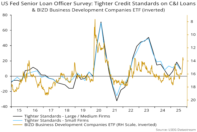
Last week’s ECB bank lending survey signalled tighter credit standards and notably weaker loan demand – see previous post and chart 1. The corresponding Fed survey this week, by contrast, shows little change from last quarter – chart 2. (Note that the Fed survey asks about current conditions, while the ECB survey additionally canvasses expectations.)
Chart 1
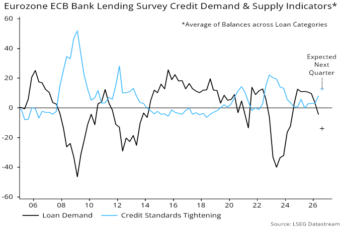
Chart 2
The last Bank of England credit conditions survey, released on 9 April, was benign but partly pre-dated Gulf hostilities.
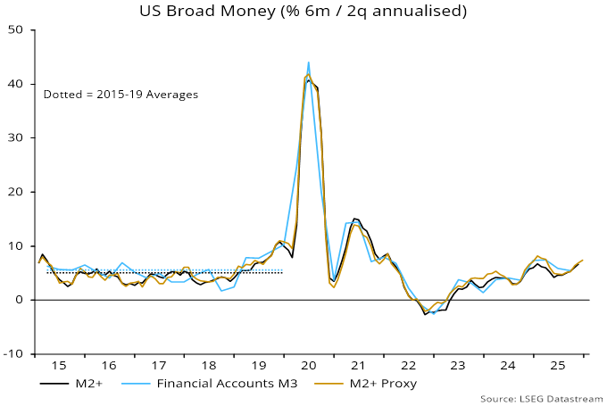
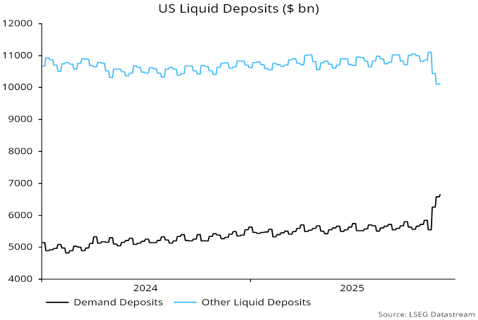
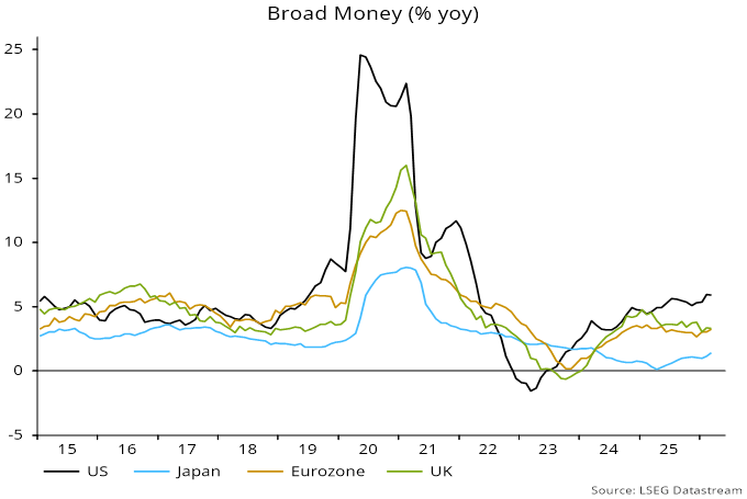
US annual broad money growth – as measured by “M2+”* – was 5.9% in March versus an increase of 3.3% in both Eurozone non-financial M3 and UK non-financial M4 – chart 3.
Chart 3
US annual core PCE inflation rose to 3.2% in March versus a Eurozone core CPI increase of 2.2% in both March and April. UK core CPI inflation was 3.1% in March but the number still incorporates a boost from large rises in water bills and vehicle excise duty last April – the policy-adjusted measure calculated here was 2.7%.
The US trimmed mean PCE inflation measure preferred by incoming Fed Chair Warsh was 2.4% in March but there are no Eurozone / UK numbers for comparison. The calculation excludes 31% and 24% respectively of the top and bottom “tails” of the distribution, i.e. included items have a combined weight of only 45%.
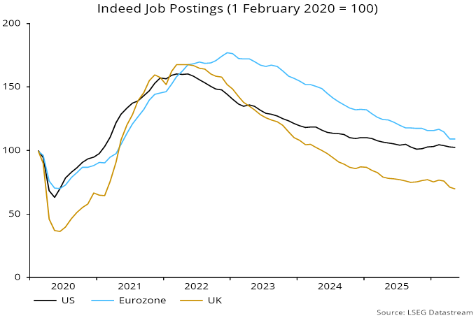
Labour demand is weaker in the Eurozone / UK than the US, with Indeed job postings making new lows versus US stability – chart 4.
Chart 4
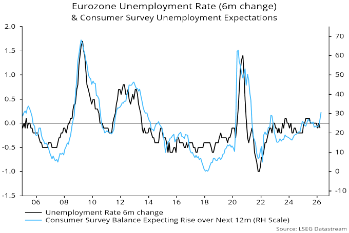
Unemployment expectations have picked up in the EU Commission consumer survey, suggesting a rise in the official jobless rate – chart 5.
Chart 5
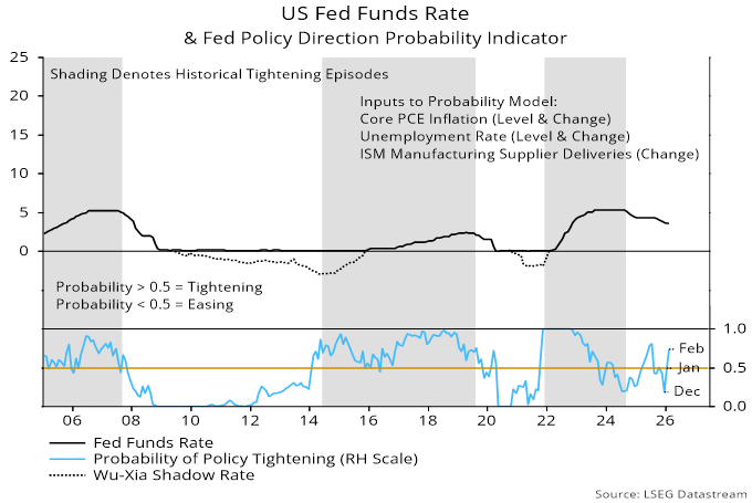
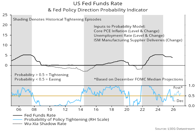
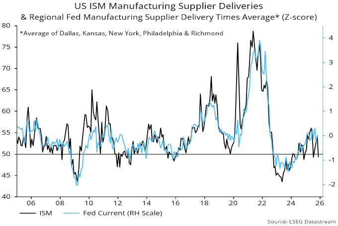
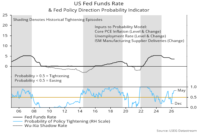
The Fed model used here predicts policy direction based on current and lagged values of annual core PCE inflation, the unemployment rate and the ISM manufacturing delivery delays index. A rise in the latter has pushed the model estimate further into the tightening zone – chart 6.
Chart 6
*M2+ adds large time deposits at commercial banks and institutional money funds to the official M2 measure.