US non-farm payrolls have risen by an average of 337,000 per month in the eight months since the Fed started hiking rates in March. The household survey measure of employment was essentially flat over this period.

The gap between the eight-month changes in the two series is at a record high, excluding April-May 2020 when data were distorted by the pandemic*. (This comparison, however, uses revised data for the two series.) 

The payrolls numbers have informed the FOMC’s judgement that “job gains have been robust”, in turn influencing the magnitude of the rise in rates this year. 

The payrolls survey covers about 670,000 worksites, while the household survey has a sample size of about 60,000. Sampling error, therefore, is larger for the household survey – the standard error of the monthly change in the household survey employment measure is more than four times that of the monthly payrolls change, according to the BLS. 

The payrolls survey, therefore, is conventionally regarded as the more reliable gauge of short-term employment movements. 

A focus on monthly sampling error, however, ignores sometimes large revisions to the payrolls data due to annual benchmarking against unemployment insurance tax records. There is no comparable annual revision to historical household survey data. 

The annual payrolls revisions have averaged close to zero over the long run but there have been clusters of negative revisions around recessions – see chart 1. 

Chart 1

Chart 1 showing Annual Benchmark Revision to US Non-Farm Payrolls (March, %)

Benchmark revisions occur with a long lag. The BLS in August issued a preliminary estimate of a 462,000 upward revision to the March 2022 level of payrolls. This will be incorporated in monthly historical data up to March 2022 in February 2023. 

Benchmark revisions to recent monthly data, therefore, will occur in February 2024 under current BLS practice. 

Research by the Philadelphia Fed suggests that these revisions will be negative and potentially very large. The researchers have attempted to replicate the annual BLS benchmarking procedure using quarterly UI records. They estimate that the currently-reported level of payrolls in June 2022 of 151.9 million will be revised down by 843,000, or 0.55% – chart 2. 

Chart 2

Chart 2 showing Annual Benchmark Revision to US Non-Farm Payrolls (March, %) *Sum of Benchmarked State Data (Source: Philadelphia Fed)

This would imply that payrolls grew by only 3,500 per month on average between March and June compared with the currently-reported 349,000. 

Chart 3 compares three-month growth rates of the official payrolls series, the household survey employment measure and the Philadelphia Fed benchmarked payrolls series. The May / June readings of the latter two are equal.

Chart 3

Chart 3 showing US Employment Measures (% 3m annualised) *Adjusted for Annual Population Control Changes

The official payrolls measure has risen by an average of 329,000 per month in the five months since June. Monthly gains in the household survey employment measure averaged 72,000 over this period. 

A benchmarked September payrolls estimate from the Philadelphia Fed will be released in March but timely data on withheld income and employment taxes – including UI taxes – suggest that the official payrolls series has continued to overstate gains. The daily tax data are noisy but year-on-year growth of a moving average has fallen sharply since June, widening an undershoot of the normal relationship with aggregate private sector earnings growth from the payrolls survey – chart 4. 

Chart 4

Chart 4 showing US Aggregate Payroll Earnings of Private Sector Employees (% yoy) & Daily Withheld Income & Employment Taxes (10w ma, % yoy)

*The payrolls series measures jobs while the household survey measures people. The wide gap partly reflects a rise in the number of people with multiple jobs. A BLS research series is available that attempts to convert household survey employment data to a payrolls concept, including by adding multiple jobs. This series rose by an average of 103,000 per month in the eight months to November. The difference with payrolls growth is also a record excluding 2020 data.

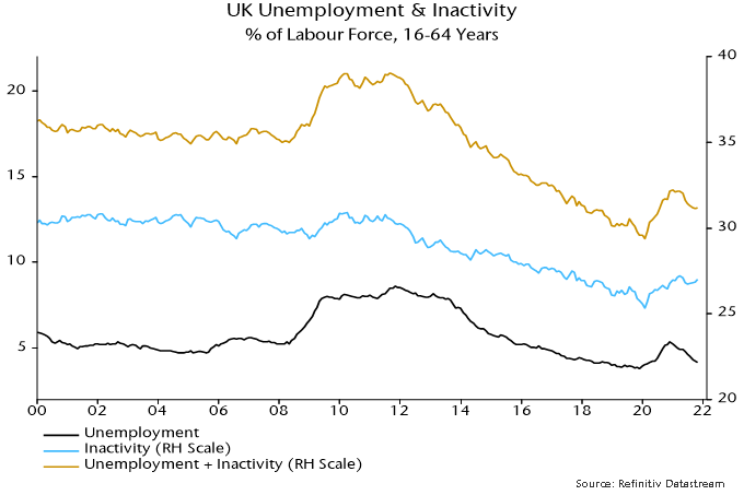
UK payrolled employment rose solidly again in November, while pay growth numbers for October surprised to the upside. It has been suggested that this news reinforces the case for a Bank rate hike of at least 50 bp this week. 

Employment is a lagging economic indicator. There is ample coincident evidence that a recession is under way. Annual broad money growth – as measured by non-financial M4 – is down to 3.4%, a level suggesting a medium-term inflation undershoot. The view here is that any rate rise this week will be a mistake. 

The monthly payrolled employment measure has a short history but it correlates closely with the quarterly (and less timely) Workforce employee jobs series. In the 2008-09 recession, the latter measure peaked two quarters after GDP.

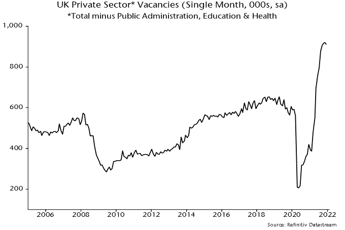
Labour market indicators that lead employment / unemployment include the stock of vacancies and average hours worked. These indicators are usually roughly coincident with GDP.

The headline vacancies series is a three-month moving average but non-seasonally-adjusted single-month numbers are available and can be adjusted using a standard procedure. The resulting series peaked in April, one month before GDP, and fell again in November – see chart 1. The recent pace of decline is comparable with the 2008-09 recession.

Chart 1

Chart 1 showing UK Monthly GDP Index & Vacancies* *Single Month, Own Seasonal Adjustment

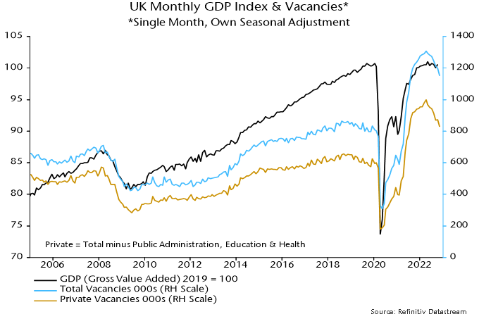
The weak November vacancies number suggests that GDP contracted significantly last month after October’s catch-up from reduced September activity due to the Queen’s funeral.

Average weekly hours tell a similar story. The series, which is available only as a three-month moving average, peaked in March and fell again in October, reaching its lowest level – excluding the pandemic recession – since 2012.

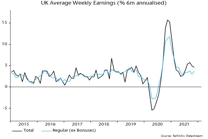
Should the MPC react to strong pay numbers? The monetarist view is that pay pressures are an effect rather than a cause of high inflation and will moderate as the dramatic slowdown in money growth since 2021 feeds through to slower price rises.

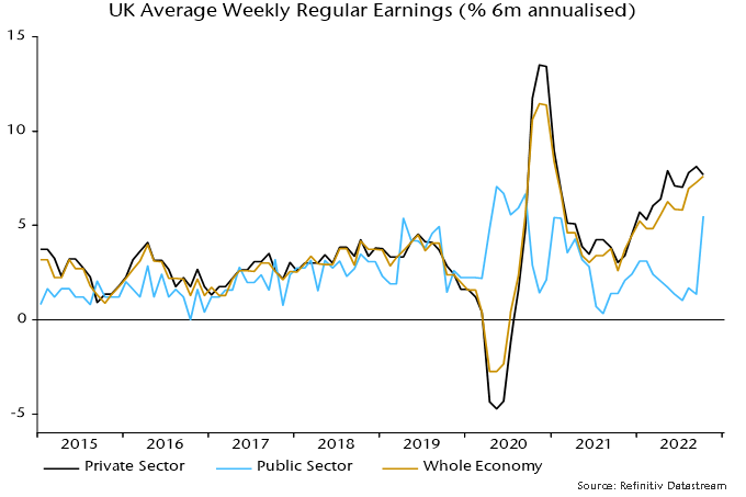
The latest upside surprise, in any case, reflects a belated catch-up in public sector pay; six-month growth of private sector regular pay is high but moving sideways – chart 2. A public sector pay pick-up may be bad news for real government spending and / or the public finances but will have little effect on the pricing behaviour of private sector suppliers of goods and services – especially against a backdrop of deepening recession and a loosening labour market.

Chart 2

Chart 2 showing UK Average Weekly Regular Earnings (% 6m annualised)

Revised numbers confirm that US GDP fell by 0.6% (1.1% annualised) between Q4 2021 and Q2 2022*. Hours worked in the private sector economy, meanwhile, climbed 1.1% (2.2% annualised) over the same period. What explains this disconnect and how long can it continue? 

The ”explanation” here is that economy-wide productivity was pushed far above trend by the pandemic but has been normalising this year. The reversion to trend appears complete, suggesting that labour market data will reflect output weakness going forward.

Output per hour in the business sector surged in the initial stages of the pandemic in Q2 / Q3 2000, opening up a gap of more than 4% with the prior trend – see chart 1.

Chart 1

Chart 1 showing US Output per Hour in Business Sector (2012 = 100)

Firms responded to economic contraction by laying off lower-productivity workers, boosting the average. Output returned to its pre-pandemic level in Q2 2021, requiring these jobs to be refilled. A fall in participation (due to age demographics) coupled with supply / demand mismatches slowed the rehiring process, resulting in output per hour remaining elevated until recently.

The deviation from trend had narrowed to below 1% as of Q2.

Another way of presenting the data is to compare actual hours worked in the business sector with the number implied by the current level of output, assuming that productivity had continued on its pre-pandemic path – chart 2.

Chart 2

Chart 2 showing US Hours Worked in Business Sector (2012 = 100)

A big deficit had opened up by Q2 2021 but strong employment growth and an output set-back have narrowed the gap. Monthly data through August suggest that hours worked rose solidly again in Q3 and may have converged with the output-warranted level.

With productivity back or close to trend, the GDP / employment divergence is likely ending.

The productivity trend implies that hours worked will fall if GDP rises by less than 0.2% (0.8% annualised) per quarter. Real narrow money has been contracting since January 2022, suggesting further GDP declines in Q4 / H1 2023. Labour market data may be poised for imminent deterioration.

*Gross domestic income – GDP measured from the income side – rose by 0.2% (0.4% annualised) over the same period.

The UK labour market has recovered impressively but isn’t at risk of “overheating”, as claimed by economists quoted in write-ups of this week’s data.

The number of payrolled employees is at a record but this partly reflects a large number of self-employed people switching to employee status during the pandemic. The comprehensive Labour Force Survey measure of employment remains 600,000 below its peak – see chart 1.

Chart 1

The unemployment rate for the 16-64 age group of 4.2% is almost back to its pre-pandemic low of 3.8% but has been suppressed by a rise in inactivity, which is 1.2 pp higher as a share of the labour force, i.e. the jobless rate would be 5.4% if inactivity had remained stable – chart 2.

Chart 2

High inflation is putting upward pressure on wage settlements but the six-month growth rate of regular earnings (i.e. excluding bonuses) is currently no higher than in mid-2019, at 3.7% annualised – chart 3.

Chart 3

Weak / negative real money growth is likely to be reflected in a loss of economic momentum, implying labour market cooling – chart 4. Vacancies lead and may be peaking – chart 5.

Chart 4

Chart 5