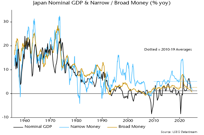
Japanese money trends remain ominously weak, suggesting poor economic / market prospects and a return of inflation to unacceptably low levels.

Annual growth rates of broad money M3 and narrow money M1 fell to 0.7% and 1.5% respectively in October, well below 2010-19 averages of 2.6% / 5.1% and the lowest since the GFC – see chart 1.

Chart 1

Chart 1 showing Japan Nominal GDP & Narrow / Broad Money (% yoy)

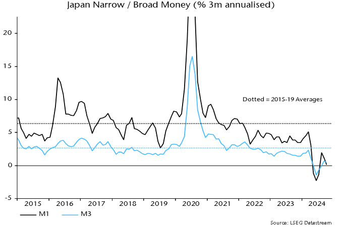
Record f/x intervention resulted in monetary contraction in Q2 but a subsequent recovery has been minor, partly reflecting BoJ policy tightening. M3 and M1 grew at annualised rates of 0.5% and 0.1% in the three months to October – chart 2.

Chart 2

Chart 2 showing Japan Narrow / Broad Money (% 3m annualised)

Japanese economic prospects represent another test of “monetarist” vs. consensus forecasting approaches. The BoJ / consensus view is that above-potential economic growth, a tight labour market and a gradual rise in adaptive inflationary expectations will result in annual CPI inflation – on both the targeted ex. fresh food measure and the BoJ’s core index also excluding energy – remaining close to the 2% target in FY 2025 and FY 2026. The BoJ views risks as skewed to the upside, warranting a tightening bias.

The “monetarist” view, by contrast, is that 2022-23 inflation resulted from a temporary spike in money growth in 2020, with the effects extended by a big fall in the yen. With money growth well below the 2010-19 average, CPI inflation is heading back to, or beneath, its corresponding average of 0.5%, unless the exchange rate suffers a further collapse.

Headline CPI numbers have been affected by changes in energy and travel subsidies but six-month core momentum (on the standard international definition excluding all food as well as energy) has fallen back below 2% annualised, consistent directionally with the earlier slowdown in money growth – chart 3. The level of core momentum still incorporates the effects of yen weakness.

Chart 3

Chart 3 showing Japan Consumer Prices & Broad Money (% 6m annualised)

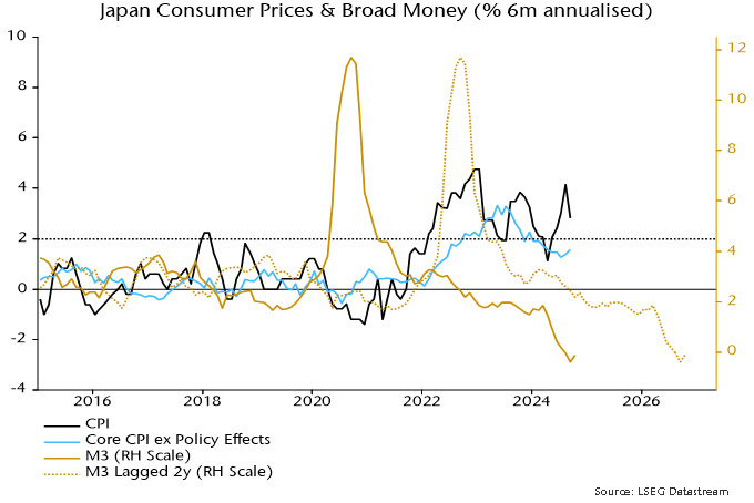
Chart 4 shows the contributions of the “credit counterparts” to annual M3 growth, with data available through September. Comparing with growth a year earlier, the largest drag has been a shift in domestic credit to government from expansion to slight contraction, reflecting the impact of f/x sales (which reduce government borrowing needs) and the BoJ moving from QE to QT.

Chart 4

Chart 4 showing Japan M3 & Credit Counterparts Contributions to M3 % yoy

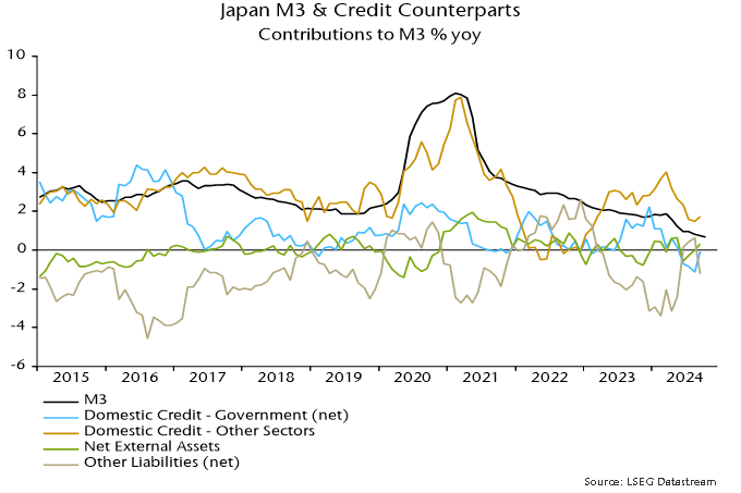
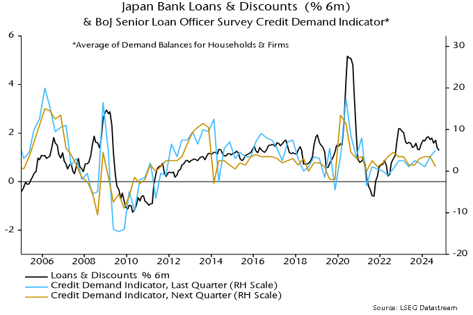
A slowdown in domestic credit to other sectors has also exerted a negative influence. The measure shown is significantly broader than the BoJ’s series for loans and discounts by commercial banks but growth in the latter has also moderated recently, while the latest senior loan officer survey reported weaker expectations for credit demand – chart 5.

Chart 5

Chart 5 showing Japan Bank Loans & Discounts (% 6m) & BoJ Senior Loan Officer Survey Credit Demand Indicator* *Average of Demand Balances for Households & Firms

Is there still an overhang of money from the 2020 surge sufficient to sustain nominal economic expansion despite current low M3 growth? This can be answered using the “quantity theory of wealth” – the idea that asset prices and incomes adjust such that a geometric average of wealth and nominal GDP rises in line with broad money over the medium term.

Chart 6 shows that, using Q4 2018 as a base, a nominal GDP undershoot relative to broad money (i.e. a fall in conventionally defined velocity) has been offset by a wealth overshoot, resulting in the average moving slightly ahead of the level implied by the money stock in Q2 2024.

Chart 6

Chart 6 showing Japan Broad Money M3, Nominal GDP & Gross Wealth* Q4 2018 = 100 *Gross Wealth = Financial Assets (ex Money) of Domestic Non-Financial Sector + Residential Real Estate

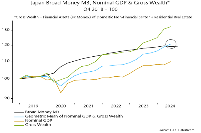
The suggestion is that an “excess” money reserve has been exhausted and, unless asset prices fall, current low money growth will be reflected in nominal economic weakness.

Global “excess” liquidity has surged to a level breached only twice over the last half-century, implying a favourable backdrop for risk assets, according to a Bloomberg article. The assessment here, by contrast, is that excess money conditions are neutral / negative.

Actual growth of the money stock can exceed or fall short of the rate of increase of money demand for economic and portfolio purposes. Deviations are reflected partly in changes in demand for financial / real assets and associated price movements.

The rate of increase of (real) money demand is unobservable. Two proxies are 1) the current rate of (real) economic expansion and 2) a long-term average of real money growth, this being assumed to capture the trend rise in money demand.

Accordingly, the approach followed here historically has relied on two flow indicators of excess or deficient money:

  • The gap between real narrow money and industrial output momentum (six-month rates of change preferred).
  • The deviation of real narrow money momentum from a long-term average (12-month rate of change preferred).

Chart 1 shows a cumulative return index of global equities relative to US dollar cash together with the two indicators. The indicators have been lagged to allow for reporting delays, i.e. the readings for a particular month would have been known at the time (ignoring revisions). Shaded areas denote double-positive readings. Equities outperformed cash significantly on average during these periods (i.e. averaging performance in the month following each monthly signal). They underperformed on average under mixed or double-negative readings.

Chart 1

Chart 1 showing MSCI World Cumulative Return vs USD Cash & Global “Excess” Money Measures

The first indicator is hovering around zero while the second remains negative.

The excess liquidity indicator referred to in the Bloomberg article is described as measuring how much real money growth outperforms economic growth, suggesting that it should resemble the first indicator above. Like here, narrow (M1) money is used in the calculation. Coverage, however, is restricted to the G10 developed markets and growth rates may be measured over 12 rather than six months.

Chart 2 shows a G7 version of the real narrow money / industrial output momentum gap calculated on a 12-month basis, which should be a close substitute for a G10 measure. This indicator turned positive in July but is far from historical highs.

Chart 2

Chart 2 showing G7 Real Narrow Money % yoy minus Industrial Output % yoy

What explains the much more bullish Bloomberg reading? The guess here is that the Bloomberg indicator is a deviation of the real money / economic growth gap from some measure of trend, rather than its absolute level. The current gap, for example, is significantly higher than a 24-month moving average, also shown in chart 2.

In this case, the Bloomberg indicator would be better described as a measure of excess money acceleration rather than growth. The current high reading would reflect a recovery in excess money momentum from deep negative to slightly positive.

Conceptually, it is unclear why the demand for assets should be related to the second derivative of excess money rather than its growth or level. The Bloomberg indicator correctly signalled the strength of equity markets this year, though not in 2023. Backtesting indicates that the sign of an acceleration measure would have underperformed that of the level of excess money growth in signalling whether equity market returns were above or below cash rates historically.

Why did the measures shown in chart 1 “miss” the strength of equity markets in 2023-24?

Excess or deficient money need not affect all markets similarly. Treasuries, commercial property and commodities may have borne the brunt of a money flow shortfall.

Preference for equities has been boosted by the AI boom and associated strength in a small number of large cap stocks. The MSCI World equal-weighted index has underperformed US dollar cash since the excess money indicators in chart 1 turned negative around end-2021.

The key reason for the disconnect with market performance, however, is that the flow measures were, on this occasion, an insufficient guide to the excess money backdrop, failing to take account of a still-large stock overhang left over from the 2020-21 money growth surge.

The “quantity theory of wealth”, explained in posts in 2020, is a suggested modification of the traditional quantity theory recognising that (broad) money demand depends on wealth as well as income and proposing equal elasticities. Nominal income is replaced on the right-hand side of the equation of exchange MV = PY by a geometric mean of income and wealth.

Chart 3 applies the “theory” to US data since end-2014.

Chart 3

Chart 3 showing US Broad Money M2+, Nominal GDP & Gross Wealth* Q4 2014 = 100 *Gross Wealth = Public Equities + Debt Securities ex Fed + Residential Real Estate

The combined income / wealth variable closely tracked moderate growth of broad money over 2015-19. Wealth rose faster than income, so traditionally-defined velocity fell. The velocity of the combined income / wealth measure was stable.

The policy response to the covid shock resulted in possibly unprecedented monetary disequilibrium. Asset prices responded swiftly to the excess, causing wealth to overshoot broad money in 2021. Excess money flow indicators turned negative around end-2021 and wealth corrected sharply in 2022.

The combined income / wealth measure was still well below the level implied by broad money even before this correction. Deployment of the excess stock fuelled a second surge in wealth from late 2022 while sustaining economic growth despite monetary policy tightening.

Asset price gains, goods / services inflation and real economic expansion resulted in the income / wealth measure finally converging with broad money at end-Q2, with an estimated small overshoot at end-Q3. So the velocity of the combined measure has returned to its end-2019 level.

Stock as well as flow considerations, therefore, suggest that the excess money backdrop is now neutral at best.

Silver Bull and Bear standing on a financial newspaper with charts.

A shift long overdue

Small-cap stocks often go unnoticed by mainstream investors, overshadowed by large-cap equities’ high visibility and liquidity. However, historical evidence shows that small caps outperform large caps over time, particularly following periods of underperformance and economic recovery. As market dynamics evolve going into 2025, we are on the cusp of such a shift, where small caps are poised to take centre stage. In this article, we explore why small caps offer a unique investment opportunity driven by valuation, earnings growth, economic trends and favourable global developments.

1. The biggest opportunity in a decade: It is all about valuation

The valuation spread between small and large caps is near historic highs, presenting a rare buying opportunity​. Over the past decade, small caps underperformed largely due to multiple compression and market focus on a handful of mega-cap tech stocks. Small caps are not lagging because of weak fundamentals, but due to shrinking valuations.

Valuation reversion: Markets are cyclical, and periods of large-cap dominance are often followed by small-cap rallies. Historically, small caps have delivered superior returns during periods of economic expansion and market recovery. Small-cap stocks are trading at discounts to historical averages, offering investors a margin of safety that large caps currently lack.

A line chart illustrating the Price to Earnings of Small Cap Relative to Large Cap referencing the MXEASC Index/MXEALC Index.
Source: Bloomberg

A line chart illustrating the Price to Earnings of Small Cap Relative to Large Cap referencing the MXWOSC Index/SPX Index.

Source: Bloomberg

2. Superior earnings growth and the case for quality

Earnings growth is a critical driver of stock performance, and small caps are well-positioned in this regard. Analysts estimate small caps will post higher EPS growth than large caps through 2025 and 2026. Considering the current macroeconomic environment, focusing on quality is likely the most effective way to gain exposure to small-cap companies. The valuation reset in 2022 and the dominance of large-cap stocks in 2023 have resulted in many high-quality small caps being available at more attractive prices. Additionally, adopting a global perspective is beneficial in this context, as it reduces reliance on the performance of specific economies.

A bar chart comparing different indices to illustrate Small cap earnings growing faster than large cap.

Source: Bloomberg

3. Macro trends favouring small caps: The winds of change

Small caps are particularly sensitive to changes in interest rates and economic policies. As inflation moderates and central banks signal a shift toward more accommodative monetary policies, small caps stand to benefit. Many small-cap companies rely on external financing for growth, making them more responsive to falling interest rates than large-cap peers​. The current outlook suggests that even modest rate cuts could trigger significant outperformance in small caps.

Broadening market performance: The 2024 equity market has seen a shift in breadth, with smaller companies starting to outperform mega-cap technology stocks​. A narrowing of the gap between outperforming large-cap tech and the broader market is historically a precursor to small-cap rallies. In the third quarter, both MSCI World Small Cap and MSCI EAFE Small Cap outperformed large caps and the NASDAQ index.

A line chart comparing different indices to illustrate that MSCI World Small Cap and MSCI EAFE Small Cap outperformed large caps and the NASDAQ index in the third quarter.

Source: Bloomberg

4. EAFE small caps: Untapped potential and diversification

Beyond US borders, global small-cap equities present an additional layer of opportunity for investors seeking diversification. These stocks offer superior risk-adjusted returns, with lower correlations to US large-cap equities. International small caps have consistently outperformed their large-cap counterparts in various regions, including Europe and Japan. Despite this track record, they remain underrepresented in most portfolios, offering an underexplored opportunity.

Risk mitigation through diversification: Small-cap indices globally encompass over 6,000 companies, allowing for exposure to diverse industries and geographies. This diversity can help offset regional risks and stabilize returns​.

5. Volatility: Embracing market fluctuations for long-term gains

While small caps are inherently more volatile than large caps, this volatility can be harnessed as an advantage. Experienced investors recognize that volatility creates opportunities to buy undervalued stocks​.

Opportunities in market inefficiencies: Small-cap stocks are often under-researched and mispriced, creating fertile ground for active managers to generate alpha through stock selection.

Active management as a competitive edge: Active small-cap managers, particularly those focused on value and quality, have historically outperformed passive benchmarks during periods of heightened volatility​.

Downside protection through quality: Quality-focused small-cap portfolios have demonstrated lower drawdowns during bear markets, providing investors with enhanced downside protection and peace of mind.

6. Historical patterns: Small caps shine in post-election

Historical evidence suggests that small caps tend to outperform following US presidential elections, driven by reduced policy uncertainty and potential regulatory easing​. This trend is expected to continue in the current cycle, especially as small caps are well-positioned to benefit from a pro-growth environment.

Post-election boosts: Small caps have outperformed large caps in the 12 months following each of the past 10 presidential elections, regardless of the party in power​.

A bar chart comparing the S&P 500 Index to the Russell 2000 Index to illustrate Small Cap performance post presidential election.

Source: Bloomberg

Conclusion: A rare and timely opportunity

The case for small caps has never been stronger. Valuation gaps, superior earnings growth, favourable macroeconomic conditions, and global diversification opportunities all point to a potential resurgence in small-cap performance. Investors who embrace small caps today stand to benefit from both short-term reversion trends and long-term structural advantages.

While volatility remains a hallmark of small-cap investing, the opportunities it creates are well worth the ride. A focus on quality companies with strong fundamentals can help mitigate risks and enhance returns. With the market poised for a shift, now is the time for investors to rebalance portfolios and capitalize on the potential offered by small caps. As the famous phrase goes, “A picture is worth a thousand words,” below illustrates why small cap is the asset class to be invested in.

A line chart comparing different indices to show the growth of small caps.

Source: Bloomberg

170 René-Lévesque East, a newly constructed, 20-storey multi-family building.

Crestpoint Real Estate Investments Ltd., on behalf of the Crestpoint Core Plus Real Estate Strategy (its open-end fund), is excited to announce the acquisition of 170 René-Lévesque East, a newly constructed,  20-storey multi-family building. Featuring 248 best-in-class residential units comprising a mix of suite sizes and 81 parking stalls, the property offers exceptional amenities such as a rooftop pool, high-end gym and modern common areas. The property is strategically situated in a prime “live-work-play” location, with excellent transit connectivity and proximity to world-class universities, shopping, entertainment and healthcare facilities. This is an investment opportunity for Crestpoint to acquire a high-quality asset in downtown Montreal, adding to its multi-family presence in this market. Crestpoint entered into this 50/50 joint venture transaction with InterRent REIT, which will also act as property manager.

American flags wave in the foreground with the U.S. Capitol in the background during a presidential inauguration.

2024 has been a historically significant year for elections, with around half the world’s population having the opportunity to vote. We are on the eve of the main event of the year: the US election. In the Republican red corner, we have the challenger, former President Donald Trump. In the Democratic blue corner, Vice President Kamala Harris. This week’s commentary looks at potential impacts of each outcome and how stock markets have typically reacted post-election.

Industries such as energy, financial services and manufacturing that have potential for diverging directions on policy depending on the winner of this election.

Energy

Regarding energy, the current Democratic administration has been more willing to act against climate change. One would imagine VP Harris will continue this work into her term should she win, and renewable investments would remain beneficiaries of subsidies or tax breaks. Should Trump win, this support could come under pressure and preferences would shift to traditional fossil fuels in the name of energy security. Environmental regulations would loosen, permitting fast-tracked tax benefits for oil and gas firms, benefitting those with domestic exposure.

Financial services

Trump also has a history of loosening regulations in the financial industry – rolling back some of the Dodd-Frank Act to reduce regulations originally set in place to protect borrowers, for example. Should he win, this trend of deregulation may persist. However, Republicans might think twice as last year’s Silicon Valley Bank collapse was blamed by some on those same roll-backs. Harris, on the other hand, has a record of holding banks accountable during her time as California’s attorney general, advocating for a relief package to help residents impacted by foreclosures and what she considered predatory practices around student loans. She may keep up her efforts if elected.

Manufacturing

The two parties are somewhat closer aligned on manufacturing. Both publicly support US manufacturing while placing restrictive measures on China. Where the differences lie are in the industrial end markets. Trump is more vocal about China (proposing a 60% tariff on Chinese imports), but also about foreign competition in general, floating a 10% tariff on all US imports. If trade barriers do increase, domestic manufacturers who use US-based facilities to serve the US market will be at a clear advantage. “Made in the USA” is an intrinsic part of Trump’s “Make America Great Again” campaign. Universal tariffs likely mean disrupting trade flows and inflationary pressures; imported goods account for 10% of US consumer spending. US exports could also experience retaliatory measures by other countries.

Where Trump is more supportive of traditional goods and machinery (including combustion engines), Harris and the current administration have focused on electric vehicles, alternative energy, high-tech manufacturing and supply chains courtesy of the CHIPS and Science Act. Harris’ future policy on tariffs is less known, but the current administration enforced Trump’s tariffs and shifted towards protectionism. At the least, one could foresee Harris maintaining the current administration’s policies such as the $360 billion in tariffs on goods from China and increasing certain tariffs on Mexican steel and aluminum.

Taxes

The two parties have different plans for corporate taxes. Taxes are at the forefront of Trump’s economic agenda, as they were during his first term in office. Trump’s plan is to reduce the rate to 15% (from 21%) for companies with domestic production. Harris plans to raise the rate to 28%. Combined with other tax reforms, a Harris administration could see the largest increase in revenues in decades. But could it be restrictive to growth?

Market impacts of US election results

Historically, there is no clear connection between the election result and capital market performance in the medium- to long-term. Even the narrative of investor uncertainty leading to lower returns heading into an election has proved untrue this time around. As of October 18, the S&P 500 Index had gained 23% year-to-date, having hit 47 record highs along the way and riding the wave of six consecutive weeks with gains. Investor sentiment currently drives stocks as much as fundamentals so the details of the respective policies may not be what moves markets after election day. Returns tend to be stronger in non-election years, regardless of the election outcome, and often higher when an incumbent party is re-elected and when one party wins decisively, suggesting larger policy changes.

GACM_COMM_2024-10-31_Chart01

Source: Bloomberg. Annualized Performance is calculated using S&P 500 Level 1 GICS sector indices. Data starts in 1992 and covers eight election cycles.

With the usual caveat of historical performance not being a guarantee of future results, it is interesting to note that small caps (in this case the Russell 2000) have outperformed large (Russell 1000) by an average of 5.5% in the 3-month period after the last ten presidential elections, and by 3.3% over the subsequent 12-month period.

Diversification remains key

As in previous commentaries, we believe our diversified portfolio is especially critical in periods of uncertainty. Election outcomes can heavily influence economic policies, affecting taxation, regulations and economic reforms. These changes have the power to shape various sectors and industries in profound ways. Safeguarding your investments by diversifying across different securities and industries continues to be a wise strategy.

Quality companies that demonstrate enduring strength, guided by capable management and driven by long-term secular trends are well-equipped to weather the market’s ups and downs. Their resilience and adaptability often become key to their sustained success, offering a more grounded perspective for investors looking beyond the immediate horizon of shifting politics.

Global (i.e. G7 plus E7) six-month real narrow money momentum is estimated to have edged lower in September, based on monetary data covering 88% of the aggregate. Momentum has been moving sideways since the spring at a weak level by historical standards, suggesting that the global economy will expand at a below-trend pace through mid-2025 – see chart 1.

Chart 1

Chart 1 showing Global Manufacturing PMI New Orders & G7 + E7 Real Narrow Money (% 6m)

Note that the global narrow money measure incorporates an adjustment for a recent negative distortion to Chinese data from regulatory changes, i.e. momentum would be weaker than shown without this correction.

A low in real money momentum in September 2023 was expected here to be reflected in a decline in global industrial momentum – as proxied by the manufacturing PMI new orders index – into a low in late 2024. October flash results could be consistent with a bottoming out: PMIs fell in Japan and the UK but recovered slightly in the US and Eurozone – chart 2.

Chart 2

Chart 2 showing Manufacturing PMIs

With money trends remaining weak, a manufacturing recovery into H1 2025 was expected to be limited and offset by a loss of momentum in services. Services business activity indices in the Eurozone and UK fell to 20- and 23-month lows respectively in October, according to flash results, with a sharper decline in Japan. US activity and new business indices, however, were strong, although the employment component remained sub-50.

Chart 3

Chart 3 showing Services PMI Business Activity

US relative strength is also evidenced by October earnings revisions ratios, with US net upgrades contrasting with weakness in Japan and Europe, particularly the UK – chart 4.

Chart 4

Chart 4 showing MSCI Earnings Revisions Ratios (IBES, sa)

US economic outperformance is consistent with a recent wide gap between US and European / Japanese six-month real narrow money momentum. The expectation here was for a US pull-back in September due to an unfavourable base effect but this proved minor, with narrow money rising solidly again on the month – chart 5.

Chart 5

Chart 5 showing Real Narrow Money (% 6m)

Eurozone / UK real narrow money momentum continues to recover but disappointingly slowly, suggesting a more urgent need for policy easing. A slump in Japan, initially due to f/x intervention but sustained by BoJ policy tightening, signals likely further negative economic news.

US narrow money acceleration started long before the September rate cut and hasn’t been mirrored by broader aggregates. One interpretation is that households / firms are accumulating “transactions” money in anticipation of increasing spending after the elections. Chart 6 suggests a tendency for narrow money momentum to pick up into presidential elections and reverse thereafter, with occasional notable exceptions (1984, 2000).

Chart 6

Chart 6 showing US Narrow Money (% 6m annualised)

Young Asian woman washing her face using skincare products.

The rise of Japanese beauty (J-beauty) on the global stage has been remarkable in recent years, driven by a unique blend of tradition, innovation and changing consumer preferences. This has positioned Japanese cosmetics and skincare products as highly sought-after items in the international beauty market.

Japanese beauty products have experienced significant growth in international markets. With the Japanese cosmetics industry valued at over 3 trillion yen, it ranks as one of the largest beauty markets globally, second only to the US and China. This expansion is projected to continue, with the market expected to reach USD 36.93 billion by 2029, growing at a compound annual growth rate (CAGR) of 2.87%.

Factors driving J-beauty’s global appeal

Skincare-first philosophy

The Japanese approach to beauty emphasizes skincare over makeup, resonating deeply with global consumers. This philosophy, rooted in the belief that beauty is an extension of overall health and wellness, is characterised by multi-step skincare routines focused on hydration, protection and prevention.

Technological innovation

Japanese beauty brands are renowned for their leading research and development. The seamless integration of technology and nature in product formulations sets J-beauty apart. Advanced ingredients like hyaluronic acid, ceramides and collagen are commonly used, while a continuous emphasis on innovation keeps them ahead of competition.

Natural and traditional ingredients

The use of unique Japanese ingredients like sake, fermented rice water and camellia oil provides a distinctive edge in the global market. This focus on natural and traditional elements aligns with the growing consumer preference for clean and sustainable beauty products. Though sustainability has been gaining traction in traditional beauty recently, it has always been rooted in J-beauty brands.

In addition, the rise of social media and e-commerce platforms has played a crucial role in J-beauty’s global expansion. Approximately 80% of beauty shoppers utilize social media daily, with 62% turning to influencers for product recommendations. This digital presence enables Japanese brands to reach international audiences effectively and more quickly than in the past. Changing consumer preferences have also helped it rise on the global stage. In the last few years, the “clean girl” beauty trend has emerged on Tik Tok and Instagram that emphasizes a fresh and natural appearance that accentuates one’s natural features. The minimalist approach to beauty, focusing on skin health rather than heavy makeup, has influenced global beauty trends. This “skinimalism” concept resonates with consumers seeking more sustainable and effective beauty solutions offered by J-beauty brands.

Kosé

One of our holdings has been capitalizing on this trend. Kosé (4922 JP) is a Japanese company founded in 1946 is a manufacturer and retailer of J-beauty products ranging from skin care to makeup to hair care. The company has a distribution network in over 20 countries with many different brands under its umbrella, but the most known in North America is tarte, widely sold in Sephora and Ulta stores. The company’s other brands include Decorté, Albion, Sekkisei and Kosé.

Capitalizing on the rise of clean beauty and J-beauty in North America, tarte’s cosmetics have continued to gain popularity and grow market share as a result. In H1 of 2024, the company saw a 38% year-over-year revenue growth in North America from tarte. We believe that the company will continue to capitalize on this trend and grow not only in North America, but in other parts of the world.

The MPC’s slowness to cut rates risks aggravating a recent loss of economic momentum and prolonging an inflation undershoot.

The expected 25 bp cut in November would be insufficient to catch up with reductions to date in the Eurozone, Sweden, Switzerland and Canada – see chart 1.

Chart 1

Chart 1 showing Main Policy Rates

UK annual headline consumer price inflation is as low or lower than in all these jurisdictions except Switzerland – chart 2.

Chart 2

Chart 2 showing Headline Consumer Prices (% yoy)

The MPC’s focus on the “core services” third of the inflation basket is misplaced. Monetary conditions determine aggregate inflation, with the component breakdown partly shaped by “exogenous” factors. A fall in energy prices and slowdown in food costs have suppressed headline inflation while allowing consumers to spend more on other items, delaying price deceleration in these areas.

This suggested that services disinflation would speed up as commodity prices stabilised or recovered, a development that appears to be playing out – chart 3.

Chart 3

Chart 3 showing UK Core Services* ex Rents CPI *Ex Airfares, Package Holidays & Education

Six-month consumer price momentum continues to mirror the profile of broad money growth two years earlier, a relationship suggesting a further decline and extended undershoot of the 2% target. A recovery in six-month broad money momentum has stalled below the 4.5% pa level historically consistent with 2% inflation – chart 4.

Chart 4

Chart 4 showing UK Consumer Prices & Broad Money (% 6m annualised)

UK six-month real narrow money momentum is negative and similar to levels in the Eurozone, Sweden and Switzerland, suggesting equally poor economic prospects – chart 5.

Chart 5

Chart 5 showing Real Narrow Money (% 6m)

The double dip mooted in an earlier post could be under way. Recent signs of a loss of momentum include a faster rate of decline of job vacancies and an increase in small firm earnings downgrades – chart 6.

Chart 6

Chart 6 showing UK GDP (% 2q), Vacancies* (% 6m) & FT Small Cap Earnings Revisions Ratio *Single Month, Own Seasonal Adjustment
The previous government’s fiscal plans implied significant tightening in 2024 and 2025, according to the OBR – chart 7. Changes to the fiscal rules to be announced by Chancellor Reeves will allow for additional medium-term borrowing but are unlikely to alleviate near-term restriction.

Chart 7

Chart 7 showing UK Public Sector Cyclically Adjusted Net Borrowing (% of GDP)

It might be expected that the MPC would be especially sensitive to downside risks, following its mistake of responding too late in the opposite scenario in 2021-22 when inflation was starting to rip. Could confirmation of economic weakness and a restrictive Budget yet put a warranted 50 bp on the table for November?

post last month suggested that Chinese money growth was bottoming, based on year-to-date policy easing and the space for additional stimulus opened up by a stabilisation of the currency. September money numbers and recent policy announcements bolster this assessment but the scale of monetary acceleration is uncertain.

As previously discussed, narrow money measures have been distorted by regulatory changes in April that reduced the attractiveness of demand deposits, arguing for giving greater weight to broader aggregates. Six-month growth of the preferred broad measure here – M2 excluding deposits of non-bank financial institutions – bottomed in June, edging up further in September. Broad money has led nominal GDP by around six months at momentum turning points historically, suggesting that two-quarter nominal GDP expansion will bottom by year-end – see chart 1.

Chart 1

Chart 1 showing China Nominal GDP (% 2q) & Money / Social Financing (% 6m)

Narrative about the insufficiency of the latest initiatives may underestimate policy stimulus already in the pipeline. Government net securities issuance reached CNY10.8 trillion or 8.3% of GDP in the 12 months to September, the highest proportion since 2017 and up by 2.6 pp from the prior 12 months. A further increase is likely. The banking system buys the bulk of securities so increased issuance usually boosts broad money growth (unless funds are used to repay other bank lending or increase system capital) – chart 2*.

Chart 2

Chart 2 showing China Net Issuance of Government Securities (12m rolling as % of GDP) & Banking System Net Lending to Government (12m change as % of M2)

Stimulus packages in 2008-09 and 2015-16 succeeded in reflating nominal GDP growth; smaller-scale initiatives in 2012-13 and 2019-20 resulted in stabilisation but little increase – chart 3. The extent of a recovery in money growth will signal which scenario is more likely. Markets appear to be discounting the latter: the yield curve (10s-2s) has steepened but less than in 2009 and 2015, while the rally in MSCI China still leaves it on a significant forward P / E discount to the rest of EM – chart 4.

Chart 3

Chart 3 showing China Nominal GDP (% yoy) & Stimulus Episodes

Chart 4

Chart 4 showing China & EM ex China Forward P / Es

*Increased issuance is reflected initially in a rise in fiscal deposits, excluded from monetary aggregates. The monetary impact occurs when funds are deployed. A rise in fiscal deposits reduced the contribution of banking system net lending to government to annual M2 growth by 0.3 pp in September.

Close-up of an old water faucet leaking a few water drops.

Recently, we have witnessed one city after another come closer to Day Zero with alarming regularity. Day Zero is the critical point at which a city’s water supply goes completely dry. Earlier this year it was Mexico City and Bogota. In 2018, it was Cape Town, and in 2015, wells in central California went dry. Water scarcity does not distinguish between rich or poor countries. With population growth and climate change further straining water resources, expect to see more Day Zero headlines in the near future.

Sadly, until the taps run dry, water scarcity is not at the top of most people’s minds. Most people take a running tap for granted. But it’s worth highlighting that 97% of Earth’s water is salty. That means only 3% of all water available on earth is fresh water, and 2% is locked up in permafrost. That leaves a measly 1% to go around for all of humanity. As seen in the chart below, this precious resource is not distributed evenly. And its extraction around the world – as seen in the second chart – is clearly not correlated to availability.

Map of the world showing physical water stress based on data from National Geographic and UNICEF.Source – National Geographic, UNICEF
Map of the world showing freshwater withdrawal as a proportion of available freshwater resources in 2019 based on data from the Food and Agriculture Organization of the United Nations with graphic from the Guardian.
Source: Food and Agriculture Organization of the United Nations


Take the world’s most populous country – India. According to Central Water Commission of India, water availability in India has from 6,042 cubic metres per capita in 1947 (the year of Independence) to just 1,486 cubic metres per capita by the end of 2021. Water scarcity in most regions is the result of simple supply and demand dynamics. Supply of safe, usable water comes from surface water sources like lakes and rivers and from groundwater through aquifers. On the demand side, 70% of the demand comes from agriculture, 19% from industrial use and the remaining 11% from domestic needs like drinking and sanitation.

And demand is growing for several reasons. Besides population growth, water-intensive crops like cotton and sugarcane can be more profitable for farmers. A change in diet as populations grow more affluent means more consumption of water-hungry food items like nuts (walnuts, pistachios and almonds) and more consumption of meat. Creating a pound of beef requires more than 8,000 litres of water which is around eight times as much as vegetables and 20 times as much as wheat and corn.

While climate change is exacerbating water shortages, we ironically need more water (via lithium mining) to meet our climate change goals via electrification. According to the UN, the demand for fresh water is expected to outstrip supply by 40% by the end of this decade. As Mark Twain once famously said – “Whiskey is for drinking and water is for fighting.” Many countries depend on water supply originating from their neighbours. Managing and conserving water resources as a global common good might be the only way to avoid future conflicts.

A holding in our emerging market portfolio that is looking to address this issue is VA Tech Wabag (VATW IN). With a 100-year operating history, Wabag is one of the global leaders in water treatment solutions operating in India, the EU, the Middle East and Africa. Wabag works with both municipalities and industries on wastewater treatment and desalination projects. It has completed 1,450 plants around the world while developing its proprietary technology in this field with more than 125 patents and trademarks.

We like the company for its strong execution track record, technical expertise in delivering custom solutions and strong order book. We also like its discipline and selectiveness when it comes to bidding opportunities around the world. Three years ago, the company decided to deemphasize the “C” aspect of the EPC (Engineering, Procuring & Construction) model and generate more annuity revenues from operations and maintenance contracts. This shift to an asset-light model and focus on deleveraging should lead to strong value generation in the coming years.