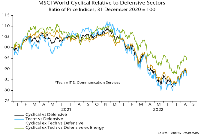
Cyclical equity market sectors have recouped part of their H1 underperformance of defensive sectors but monetary and cycle considerations suggest further weakness ahead. 

MSCI divides the 11 GICS sectors into cyclical and defensive baskets, the former comprising materials, industrials, consumer discretionary, financials, real estate, IT and communication services, and the latter consumer staples, health care, utilities and energy. 

The analysis here additionally separates the “tech” sectors of IT and communication services from other cyclical sectors on the grounds that they correlate differently with macro factors. Similarly, energy has distinct characteristics warranting separate consideration from other defensive sectors. 

Chart 1 shows various measures of cyclical sector relative price performance, all of which staged significant recoveries from July into late last week. 

Chart 1

Chart 1 showing MSCI World Cyclical Relative to Defensive Sectors Ratio of Price Indices, 31 December 2020 = 100

Is there a valuation case for cyclical sectors following their H1 underperformance? Chart 2 shows that the forward P/E of non-tech cyclical sectors relative to the defensive sectors basket is above its long-term average, suggesting overvaluation. 

Chart 2

Chart 2 showing MSCI World Cyclical Relative to Defensive Sectors P / E Ratio of Forward P / Es, Z-scores

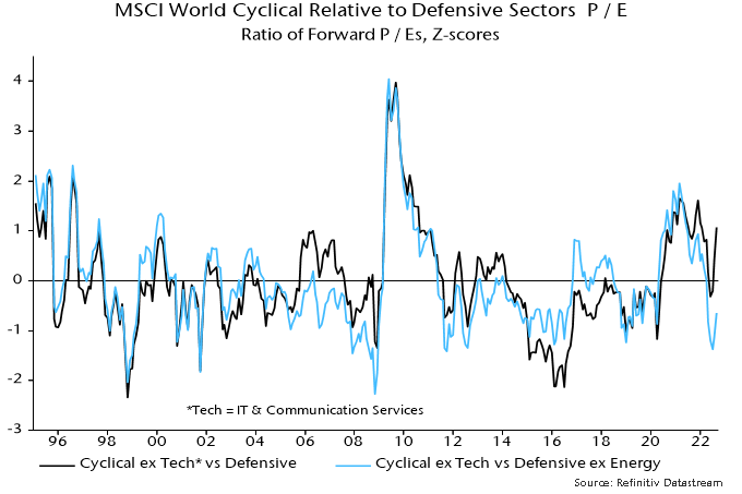
The overshoot, however, reflects current / expected high earnings in energy. Excluding energy from the defensive basket, the P/E relative was 1.4 standard deviations below average at the recent low, although the gap has since halved. 

The suggestion that non-tech cyclical sectors offer value, however, depends on current earnings forecasts proving reliable. With the global economy entering recession, downgrades are multiplying and are likely to be larger on average in cyclical sectors. The P/E relative, in other words, could normalise via earnings rather than a cyclical relative price recovery. 

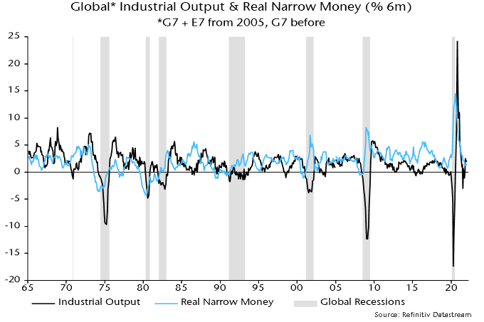
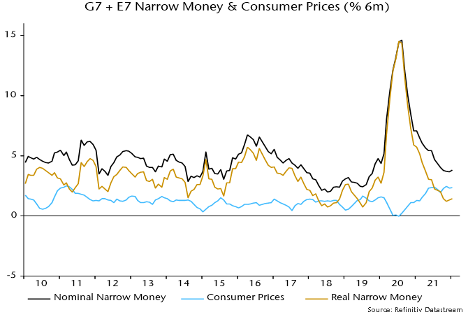
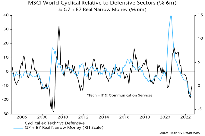
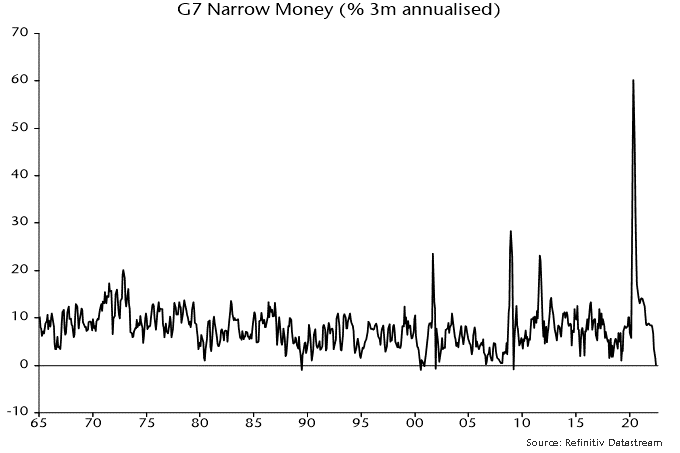
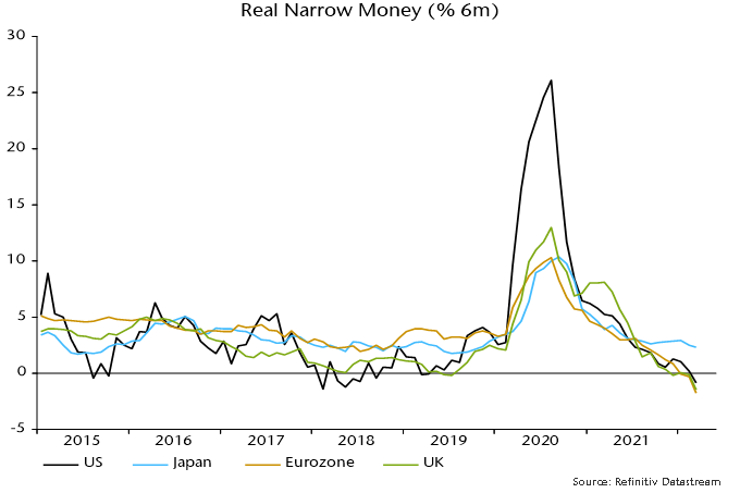
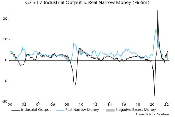
Global monetary trends continue to suggest cyclical weakness. Six-month real narrow money momentum usually moves ahead of major swings in relative price momentum but remains stuck at a multi-decade low – chart 3. 

Chart 3

Chart 3 showing MSCI World Cyclical Relative to Defensive Sectors (% 6m) & G7 + E7 Real Narrow Money (% 6m)

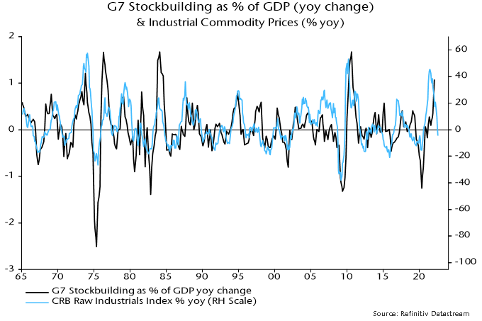
Cyclical relative performance also correlates with the stockbuilding cycle, which, according to the assessment here, is entering a downswing that is unlikely to bottom before mid-2023. Chart 4 shows a long-term history of the cycle, with shaded areas marking 18-month windows preceding prior lows. 

Chart 4

Chart 4 showing G7 Stockbuilding Cycle G7 Stockbuilding as % of GDP (yoy change)

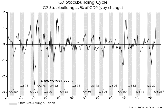
Chart 5 reproduces the shading in chart 4, superimposing the drawdown from a rolling two-year high of the non-tech cyclical / defensive sector price relative (including and excluding energy). Historically, the price relative has usually bottomed late in the downswing, or even after the trough. 

Chart 5

Chart 5 showing MSCI World Cyclical to Defensive Sectors Ratio of Price Indices, % Deviation from 2y High

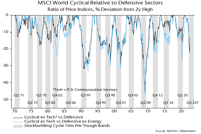
Cyclical sectors also underperformed sharply at the start of downswings in 2000 and 2011. Minor recoveries ensued followed by a second bout of weakness as the cycle moved towards the trough. 

A major relative price low in July so soon after the cycle peak would be unprecedented.

The yield spread over Treasuries of the ICE BofA US corporate high yield index rose from 310 bp at end-December to a peak of 599 in early July. It has since retraced more than half of this move. Was the early July peak a major top, with a further decline in prospect? This seems unlikely, for several reasons.

First, the “financing gap” of non-financial corporations – the difference between capital spending and domestic retained earnings – is a long leading indicator of credit spreads and has widened significantly in recent quarters.

Chart 1 shows an expanded measure of the gap including financing required for net equity purchases. This measure moved from a negative position (i.e. a surplus) in Q1 2021 to 4.3% of GDP in Q1 this year, reflecting a strong rise in capital spending – including on inventories – and a pick-up in equity buying.

Chart 1

Chart 1 showing US ICE BofA High Yield Index Option-Adjusted Spread (bp) & Non-Financial Corporate Business Financing Gap* (% of GDP) *Including Financing for Equity Purchases (net)

The expanded financing gap rose above 4% of GDP in 1989, 1998, 2000, 2006 and 2019. The high yield spread subsequently increased to at least 850 bp. (The gap also exceeded 4% in Q4 2017 but was temporarily inflated that quarter by revenue shifting by corporations to take advantage of lower tax rates from 2018 – there was an offsetting surplus in Q1 2018.)

Secondly, the high yield spread correlates contemporaneously with the credit tightening balance in the Fed’s senior loan officer survey – chart 2. This rose sharply between April and July and special questions in the July survey suggest a further increase in H2 – see previous post for more details.

Chart 2

Chart 2 showing US Fed Senior Loan Officer Survey Credit Standards Tightening Indicator* & ICE BofA High Yield Index Option-Adjusted Spread (bp) *Average of Balances across Loan Categories

Thirdly, the stockbuilding cycle is judged here to have entered a downswing that may – based on the average length of the cycle – extend into mid to late 2023. Historically, the high yield spread has usually peaked late in the downswing or even after the trough – chart 3. The 2011-12 downswing was an exception but the early surge in the spread on that occasion probably reflected credit market contagion from the Eurozone sovereign debt crisis.

Chart 3

Chart 3 showing US ICE BofA High Yield Index Option-Adjusted Spread (bp)

Finally, the two measures of global “excess” money tracked here remain negative, a condition historically associated with a widening spread on average – table 1. The first measure – the gap between six-month real narrow money and industrial output momentum – may turn positive during H2 but the second measure – the deviation of 12-month real momentum from a moving average – will almost certainly remain negative. That combination has also been negative for credit historically.

Table 1

Table 1 showing Average Change in US High Yield Spread ICE BofA Index, 1986-2021, bp annualised

The Fed’s July senior loan officer survey signals a major slowdown in US bank lending in H2 and 2023.

Most commentary focuses on survey responses about credit standards and demand for commercial and industrial (C&I) loans. However, the Fed calculates aggregate indicators incorporating data for all loan categories (i.e. also including commercial real estate (CRE), consumer and residential mortgages).

These indicators weakened sharply in Q2*, moving below their averages since 1995 – see chart 1.

Chart 1

Chart 1 showing US Commercial Bank Loans & Leases (%6 m) & Fed Senior Loan Officer Survey Credit Demand & Supply Indicators* *Weighted Average of Balances across Loan Categories

Demand for residential mortgages weakened most, with smaller declines for CRE and consumer loans. C&I loan demand remained strong, driven by inventory financing (negative for economic prospects).

Credit tightening was across the board but most pronounced for CRE and C&I loans. Banks cited a less favourable economic outlook, industry-specific problems and reduced risk tolerance as key drivers of the tightening of C&I loan standards.

Is the degree of credit restriction consistent with a recession? The Fed’s aggregate credit tightening indicator combines data for the various loan categories using their weights in banks’ lending books. The indicator is unavailable before 1995 but similar results are obtained using a simple rather than weighted average, and this alternative indicator can be estimated for earlier years from partial data for the loan categories.

Chart 2 shows that this alternative indicator rose above 28% before or during seven of the last eight recessions, with no false positive signals. The single false negative was the double-dip recession of 1981-82, which was arguably an extension of the 1980 contraction rather than a separate cyclical event.

Chart 2

Chart 2 showing US Fed Senior Loan Officer Survey Credit Standards Tightening Indicator* *Average of Balances across Loan Categories

The indicator rose from -4% in the April survey to 17% in July, i.e. below the critical value. The current level was reached in 1968, 1978 and 1998 without an accompanying recession.

The July survey, however, included special questions about banks’ expectations for credit tightening for selected loan categories in H2. A net 52% expect to tighten standards on C&I loans, up from an actual 23% in Q2. Smaller but significant increases are signalled for consumer loans and residential mortgages. Assuming no change for CRE loans (which were not covered by the special questions), the aggregate alternative indicator in chart 2 is forecast to rise to 33%, i.e. above the 28% recession threshold.

*The survey cut-off date was 30 June.

Central bankers have ignored the lessons of their 2020-21 policy blunder and deserve the opprobrium they are likely to attract as an economic debacle continues to play out over coming quarters.

Policy-making can be accurately described as anti-monetarist, not merely in the sense that money data are ignored but rather that decisions are the precise opposite of those warranted by monetary trends.

The central banks continued to pursue ludicrously outsized QE in 2020-21 even as money growth surged to a level that would have embarrassed their 1970s predecessors; and they ripped up earlier guidance and tightened aggressively this year despite monetary trends screaming recession and now deflation risk.

June money data for the US, Eurozone and UK published this week highlight the scale of the policy fiasco under way before this month’s further tightening moves. (The Bank of Japan deserves an honourable mention for refusing to join the lemming rush.)

With Canada yet to release June data, the six-month rate of change of G7 real narrow money is estimated to have fallen further to -3.1% (-6.1% annualised), a level previously reached only before / during severe recessions in the mid 1970s and early 1980s. Real broad money, meanwhile, is contracting faster than during those episodes – see chart 1.

Chart 1

Chart 1 showing G7 Industrial Output & Real Money (% 6m)

Until April, real money weakness was attributable mainly to high inflation – six-month growth of nominal narrow money, though slowing sharply, was still in the middle of its pre-pandemic range. No longer: six-month nominal growth fell to 1.6% (3.3% annualised) in June – chart 2.

Chart 2

Chart 2 showing G7 Narrow Money & Consumer Prices (% 6m)

The impact of this year’s policy tightening is better reflected in the three-month rate of change, which crossed below zero in June, a rare occurrence signalling recession and / or price declines historically – chart 3.

Chart 3

Chart 3 showing G7 Narrow Money (% 3m annualised)

The narrow money measures calculated here for the US and UK fell month-on-month in June, while the Eurozone measure was flat.

Narrow money is more sensitive to policy changes than broad money but the broad numbers are no less alarming. Three-month growth of G7 broad money slumped to 1.3% annualised in April, moving sideways in May and June – chart 4.

Chart 4

Chart 4 showing G7 Broad Money

The monetary evidence, therefore, is that policy settings had already reached overkill territory by mid-year, suggesting a severe recession with rising medium-term deflation risk.

One false counter-argument to this assessment cites the strength of bank loan growth, particularly in the US. Non-monetarists offer this as evidence that financial conditions are not yet restrictive. Even some monetarists have suggested that lending strength is relevant for assessing rate settings, since money growth will recover if lending momentum is sustained.

It won’t be. Bank lending is a coincident / lagging indicator of the economy. It is normal for loan growth to be strong and / or rising before a recession – chart 5.

Chart 5

Chart 5 showing US Commercial Bank Loans & Leases (% yoy)

Corporate loan demand has been inflated by an unusually large surge in stockbuilding that is now starting to reverse – chart 6. The ECB’s latest bank lending survey signalled a sharp fall in credit demand, along with tightening supply – expect the corresponding Fed survey next week to give the same warning.

Chart 6

Chart 6 showing US Stockbuilding as % of GDP (yoy change) & Commercial Bank Commercial & Industrial Loans (yoy change in % 3m)

The assessment of global economic prospects here has been consistently more pessimistic than that of the consensus in recent quarters. The consensus is now shifting to acceptance of US / European recessions but these are widely expected to be “mild” and / or “short-lived”. The view here remains bleaker, based on three considerations.

First, global six-month real narrow money momentum continued to weaken during H1 2022, reaching a level historically associated with serious recessions. The further decline into mid-year suggests no economic recovery before Q2 2023, allowing for an average nine-month lead.

Secondly, the 3.33 year stockbuilding cycle is judged to have peaked in Q1 2022, with a downswing likely to last at least 12 months, again suggesting no recovery before Q2 2023. The prior upswing, moreover, was exaggerated by overordering of inputs due to perceived supply shortages, raising the possibility of a larger-than-usual drag during the downswing.

Thirdly, recessions involve self-reinforcing dynamics that magnify and prolong weakness unless offset by policy intervention. Recent evidence suggesting that a tipping point into a serious recession has been reached include:

Weak business surveys. US / Eurozone PMI composite output indices fell below 50 in July, while an average of current and future new orders balances in the Philadelphia Fed manufacturing survey plunged to a level reached only before / during major recessions – see chart 1.

Chart 1

Chart 1 showing US ISM Manufacturing New Orders & Regional Fed Manufacturing New Orders (Average of Current & Future, Z-scores)

Earnings downgrades. The MSCI ACWI earnings revisions ratio had been holding up relative to business surveys but has recently fallen sharply – chart 2.

Chart 2

Chart 2 showing Global Manufacturing PMI New Orders & MSCI ACWI Earnings Revisions Ratio* *Upgrades minus Downgrades as Proportion of Total Number of Estimates

Weak commodity prices. A year-on-year fall in the CRB raw industrials index confirms that a stockbuilding cycle downswing is under way, during which prices are likely to soften further– chart 3.

Chart 3

Chart 3 showing G7 Stockbuilding as % of GDP (yoy change) & Industrial Commodity Prices (% yoy)

Restrictive credit conditions. Credit tightening and demand balances in the July ECB bank lending survey reached recession-consistent levels – chart 4.

Chart 4

Chart 4 showing Eurozone Bank Loans to Private Sector (% 6m) & ECB Bank Lending Survey Credit Demand & Supply Indicators* *Average of Balances across Loan Categories

Softer labour market data. The 13-week change in a four-week moving average of US initial claims has reached a level historically associated with recessions, while the monthly increase in UK payrolls in June was the smallest since March 2021, with recent downward revisions to initial data suggesting an actual fall – chart 5.

Chart 5

Chart 5 showing UK Payrolled Employees (mom change, 000s)

Six-month growth rates of UK narrow and broad money – as measured by non-financial M1 / M4 – fell in March. With six-month consumer price momentum rising further, real rates of change moved deeper into negative territory – see chart 1.

Chart 1

Chart 1 showing UK Money / Bank Lending & Consumer Prices (% 6m)

The six-month contraction in real narrow money in March was slightly larger in the Eurozone than the UK – chart 2 – but UK weakness will intensify in April as CPI momentum is boosted further by the rise in the energy price cap . Eurozone six-month CPI momentum, by contrast, eased slightly last month, according to flash data.

Chart 2

Chart 2 showing Real Narrow Money (% 6m)

Expressed at an annualised rate, UK six-month broad money growth was 4.2% in March, close to a 4.5% average over 2015-19 and a pace that, if sustained, would ensure medium-term compliance with the 2% inflation target.

A six-month contraction in real narrow money of the present scale was historically a reliable indicator of future economic weakness but did not always signal a recession.

A recession probability model was previously developed here combining monetary information with a range of other financial variables. Based on end-March data, the model estimates the probability of a recession in 2022 at 70% – chart 3.

Chart 3

Chart 3 showing UK Gross Value Added (% yoy) & Recession Probability Indicator

The probability estimate is derived from an equation for the annual change in gross value added (GVA) including the following variables: real narrow money, real broad money, real broad money held by private non-financial corporations, short- and long-term interest rates, short- and long-term credit spreads, real share prices (FTSE local UK), real house prices and the effective exchange rate. Adjustments were made for the impact of strikes and the 1974 three-day week. The equation was estimated on data up to end-2019 to avoid the covid shock / recession.

The model “explains” the annual GVA change three quarters ahead using current and lagged values of the inputs. The recession probability estimate refers to the likelihood, based on the model, of a negative annual GVA change three quarters ahead, i.e. the 70% estimate refers to Q4 2022. (A negative annual change is a stricter requirement than the conventional recession definition of successive quarterly falls in GDP / GVA.)

Global six-month real narrow money growth fell to zero in March*, the weakest since the GFC and a level historically consistent with recession – see chart 1. (The current reading matches a low before the 2001 recession.)

Chart 1

Chart 1 showing G7 + E7 Industrial Output & Real Narrow Money (% 6m)

A rebound in six-month industrial output growth, meanwhile, extended in March, reflecting a production catch-up from weakness in H2 2021 due to supply-side constraints. The negative real money / output growth gap, therefore, widened further.

The March fall in real money growth was driven by a further spike higher in six-month consumer price momentum. Nominal money growth was little changed – chart 2.

Chart 2

Chart 2 showing G7 + E7 Narrow Money & Consumer Prices (% 6m)

The historical relationship with commodity prices suggests that CPI momentum has overshot and will pull back, possibly sharply – chart 3.

Chart 3

Chart 3 showing G7 + E7 Consumer Prices & Commodity Prices (% 6m)

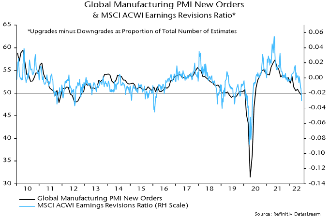
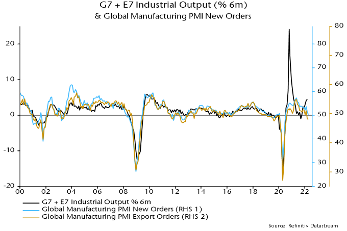
Six-month industrial output momentum, meanwhile, may move back into contraction because of Chinese covid disruption and weakening trends elsewhere, reflected in soft April global manufacturing PMI results – chart 4.

Chart 4

Chart 4 showing G7 + E7 Industrial Output (% 6m) & Global Manufacturing PMI New Orders

Nominal money growth will probably weaken in response to rising rates and as central banks end / reverse QE but falls in CPI and industrial output momentum may dominate, resulting in a narrowing of the negative real money / output growth gap. The gap, indeed, could return to positive territory by mid-year – sooner than previously expected here.

This gap is a proxy measure of global “excess” money, which – on the monetarist view – is a key driver of demand for financial and real assets**.

Historically (i.e. from 1970-2021), global equities underperformed US dollar cash by 6.7% pa on average when the gap was negative, outperforming by 12.2% pa when it was positive. These numbers refer to month-ahead returns based on the most recent reading of the gap.

Equities underperformed cash on average when the gap was negative whether or not it was widening or narrowing. The average loss, indeed, was larger when the gap was narrowing. So the near-term message for equities remains unfavourable.

It is, however, a different story for bonds. Historically, Treasury returns have been sensitive not to the level of the gap but rather its rate of change. That is, a positive change in the gap has been associated, on average, with a fall in Treasury yields (and a negative change with a rise) – chart 5.

Chart 5

Chart 5 showing US Real 10y Treasury Yield (6m change) & Global* Real Narrow Money % 6m minus Industrial Output % 6m (6m change, inverted)

This year’s yield surge is “explained” by the move in the gap into deep negative territory.

Historically, the average fall in yields associated with a positive change in the gap was similar for positive and negative levels of the gap.

The prospective change of direction of the gap, therefore, suggests that the bond bear market is ending.

A reversal in yields would have implications for equity sectors / styles. Quality historically outperformed when excess money was negative but suffered this year from its correlation with yields – the magnitude of the yield rise may have weakened its usual defensive character. (Overweight consensus positioning may also have contributed to underperformance, i.e. quality had become momentum). A yield decline could allow a performance catch-up.

The MSCI World sector-neutral quality index has already reversed more than half of its earlier YTD underperformance despite further bond market weakness, with this recovery another indication that a yield top may be imminent – chart 6.

Chart 6

Chart 6 showing US 20y Treasury Yield & MSCI World Sector-Neutral Quality Price Index Relative to MSCI World (inverted)

*G7 plus E7 aggregate. March estimate based on monetary data for all countries except Canada, Brazil and Korea (extrapolated).
**An additional proxy measure monitored here is the deviation of 12-month real narrow money growth from a long-term moving average. Historically, global equities outperformed cash on average only when both measures were positive. This second measure is expected to remain negative until late 2022, at least.

Global real money trends were signalling economic weakness before Russia’s invasion of Ukraine. The consequent spike in commodity prices threatens a recession warning signal.

Global six-month real narrow money growth – the key monetary leading indicator followed here – turned negative before the six global recessions preceding the covid shock – see chart 1. The covid recession was not a genuine cyclical contraction because it was caused by a government shutdown of economic activity rather than endogenous spending weakness.

Chart 1

Chart showing Global Industrial Output & Real Narrow Money.

With most data now in, six-month real narrow money growth was an estimated 1.4% (not annualised) in January. This decomposes into nominal money growth of 3.8% and six-month consumer price momentum of 2.3% – chart 2.

Chart 2

Chart showing G7 + E7 Narrow Money & Consumer Prices.

CPI momentum seemed likely to moderate before the invasion, based on a slowdown in the six-month change in commodity prices into December – chart 3. The latest spike suggests renewed upward pressure. A reasonable expectation is that the six-month CPI change will match the 2008 peak of 2.9% if commodity prices remain at current levels.

Chart 3

Chart showing G7 + E7 Consumer Prices & Commodity Prices.

The global inflation measure, however, will receive an additional boost from a surge in Russian consumer prices due to the rouble’s collapse. Russian six-month CPI momentum was 4.9% (again, not annualised) in January but could rise to 15-20% – chart 4. Admittedly, a larger rouble fall in 2014-15 was associated with a lower six-month inflation peak of 11.3% but the depreciation then was driven by oil price weakness, which had an offsetting effect. Russian energy prices could decline as international buyers switch to other suppliers leading to a domestic glut, but any fall is unlikely to be as large as in 2014-15, while sanctions and consequent shortages may put upward pressure on other items.

Chart 4

Chart showing Russia Consumer Prices & USDRUB.

Russia has a 4% weight in the G7 plus E7 measures calculated here so a 10-15 pp rise in six-month CPI momentum from the current level would push up global CPI momentum by 0.4-0.6 pp.

The combined effect of the commodity price spike and rouble collapse, therefore, could be to boost global six-month CPI momentum by 1 pp or more. A slowdown in six-month nominal money growth of 0.5 pp would then be sufficient for real money growth to turn negative. A slowdown of this magnitude, or greater, is plausible on the basis of QE tapering and rate rises to date, without factoring in widely expected (but unwise) future policy tightening.

A further rise in global six-month CPI momentum – if the above scenario proves correct – may take several months to play out so a recession warning from real money might not be received until well into Q2.

Last week, Europe was stunned by sounds of explosions and gunfire. The most terrible scenario repeatedly articulated by military experts and security analysts over the past few months has materialized, as Russia has launched its full-scale invasion of Ukraine. War in Europe. These words seem so surreal and are so difficult to process. It is both a humanitarian catastrophe and a challenge of the democratic order. The stakes have not been so high since the World War II.

In these tragic moments, as much as our thoughts and prayers are with the Ukrainian people living hell on earth, our duty is to analyze and anticipate the impact on markets and ensure that our portfolios are best positioned to mitigate the effect of the unprecedented events.

On the surface, Russia’s importance to financial markets is uncertain. Ranked eleventh in the world by GDP, with a stock market accounting for less than 1% of global equities in 2021, its relevance could be hastily overlooked. On the other hand, Russia’s critical role in the energy market is well understood, as it is one of the largest producers, with around 12% and 17% of the global oil and natural gas output, respectively. Europe will suffer from this war as it sources almost a third of its energy mix from Russia, with some of the key natural gas pipelines passing through Ukraine.

The direct impact on our strategies is limited at this point:

  • both our global and international small cap strategies do not invest in Russia nor in Ukraine as they focus solely on developed markets
  • in our EAFE strategy, 55% of the allocation is in Europe
  •  in our global strategy, the allocation is approximately 25%
  • our names in the region are mostly concentrated in the western part of the continent (France, Italy, Germany and Spain), in Scandinavia and in the United Kingdom.

Unlike large capitalisation companies like Total which have big production facilities in Russia, the names in our portfolio do not derive much of their revenues from sales in Russia or Ukraine, and we do not expect them to be impacted by the sanctions being imposed due to the conflict.  In addition, most of the companies we own do not have operations in these two countries. The ones that do have operations in Russia or Ukraine do not anticipate significant disruption from the situation.

Here are a few examples of names we own in Europe:

  • Vienna Insurance Group AG has the largest exposure to Eastern Europe (62% gross premiums) mostly from Czech Republic, Slovakia, Poland, Romania. Ukraine is under remaining Central and Eastern Europe (along with Albania including Kosovo, Bosnia-Herzegovina, Croatia, Moldova, North Macedonia, Serbia). This represents 4.5% gross premiums.
  • DFDS is an integrated shipping and logistics company and has a couple of ferry routes in the Baltic States that border Russia (Denmark or Sweden to Estonia/Lithuania). In 2020 this region accounted for 9% revenues, but Russia sales exposure should be zero.
  • Palfinger AG is based in Austria and manufactures hydraulic lifting solutions, loading and handling systems for all interfaces in the transport chain. Its exposure to Russia is around 2%.
  • De’Longhi is an Italian household appliance manufacturer and distributor. The company has approximately 6% exposure to Russia and Ukraine after its acquisition of Capital Brands and Eversys.
  • Bucher Industries AG is an internationally operating Swiss engineering group. Revenue exposure to Russia is in the low single digit percentage. The group has two assembly and distribution plants in Russia that focus on the local market. The Kuhn Group plant relies on some Western technologies/components.  In Ukraine, the group has one distribution facility with approximately 30 employees. To minimize FX losses, the group reduced the relevant local cash levels at the beginning of the February. 
  • Autogrill is a leader in food and beverage at airports and on motorways and has a joint venture in Russia but its contribution is insignificant in the big picture.

We also took the time to review our holdings that, even though they are not located in Europe, could be impacted by the situation. For example, in the US:

  • Gentherm is a leading manufacturer of climate control seat systems with an Ukrainian facility.
    • Located on the far western side of Ukraine, very close to the Hungarian border, it is one of their premier facilities.
    • What did they do in 2014 when Russia invaded Crimea? Logistical planning, over built slightly in existing facility, plus prepared and reserved capacities at other facilities. These measures helped protect European customers, who are comfortable with the Ukrainian facility.
    • Can this benefit? Yes, currency under pressure, and cost of goods sold is in local currency in terms of content. In 2014 the name had a positive impact on performance.
  • Titan Machinery is the largest Case New Holland dealer in the US with 75 stores, mainly in the Midwest, it also has 20 stores in Eastern Europe (Ukraine, Romania).
    • Where is the facility in Ukraine?  It is located in the center of the country. Titan does not believe its assets in Ukraine are in jeopardy.
    • What did they do in 2014? Delayed further shipment of unsold equipment into the Ukrainian market, given the environment in this region. Once a customer purchases a piece of equipment, they ship it from Western Europe into Ukraine.

And from our investments in Asia:

  • Sales from Europe for our holdings in Asia range from 6% to almost 55%.
  • DMG Mori is the largest machine tool company both in Japan and the world. Almost 55% of its revenue come from Europe with the biggest part coming from countries part of European Union (35%) excluding Germany. The portion of sales coming from Germany is only about 20%.
  • Samsonite, the world’s largest lifestyle bag and travel luggage company, has 6.5% of its sales coming from Russia. The largest part of its sales comes from North America at 37% and Asia at 36%.
  • L’Occitane, a global manufacturer, marketer and retailer of organic and natural skincare and beauty products operates in over 90 countries and has over 3,420 retail locations. Approximately 3% of their sales are in Russia.

Russia’s exports are dominated by primary industries. Main exports are crude and refined petroleum, petroleum gas, coal and wheat. In 2020, Russia was the world’s largest exporter of oil & gas combined, the second-largest gas producer (17% global output) and the third-largest oil producer (12% global output). The metals and mining industry represents between 3%-5% of Russian GDP and the country is one of the largest exporters of nickel, palladium, aluminum, platinum, steel and copper.

The nature of the Russian economy means that the highest direct revenue exposure for European Capital Goods names comes from suppliers of products, software and services to the oil & gas, metals and mining sectors.  These include ABB, Sulzer, Siemens Energy, Epiroc, Metso Outotec, Sandvik and Danieli.  Other companies with 2-3% of revenues include Schneider Electric, Alfa Laval, GEA, Konecranes and Wartsila. Mostly large cap names not names that we own in our strategy.  At this time we believe our portfolio is well positioned but we will continue to monitor the situation closely.