The current stockbuilding cycle may be approaching its mid-point, which typically marks a shift from “risk-on” to a neutral or negative market environment.
The stockbuilding (or inventory or Kitchin) cycle is usually described as ranging between 3 and 5 years. The dating here suggests a normal band of 2.5 to 4.5 years, with an average of about 3.5.
A key indicator used to inform judgements about cycle dates is the annual change in G7 stockbuilding, expressed as a percentage of GDP. Chart 1 shows a long history of this indicator, along with suggested cycle low dates.
Chart 1
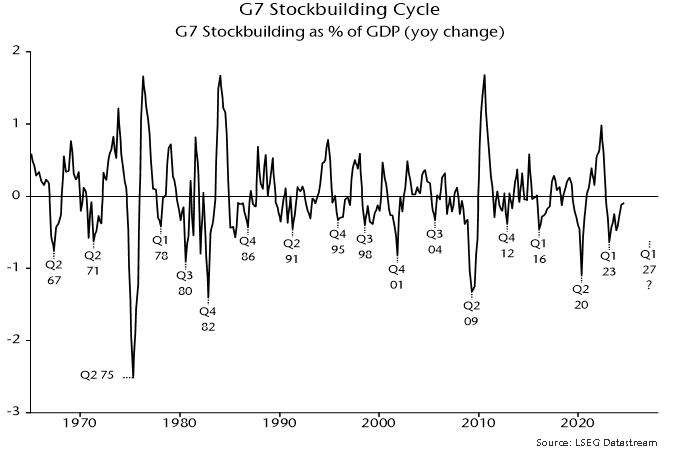
There were 16 complete cycles, measured from low to low, between Q2 1967 and Q1 2023, a period of 55.75 years. This implies an average cycle length of 3.5 years or 42 months.
The cycle described in a 1923 article by Joseph Kitchin averaged 40 months. Kitchin analysed data on bank clearings, commodity prices and interest rates and did not explicitly link his cycle with inventory fluctuations. His average was based on 9 cycles spanning 30 years, i.e. a smaller data set than shown in chart 1.
An average of about 3.5 years harmonises with the longer-term housing cycle, with an accepted average length of 18 years. Five stockbuilding cycles “nest” within each complete housing cycle, implying an average length of 3.6 years (43 months).
The most recent stockbuilding cycle trough is judged to have been reached in Q1 2023. Assuming a starting point in the middle of the quarter, November 2024 is month 21 of the current cycle.
The annual change in G7 stockbuilding was still negative in Q3 and usually becomes significantly positive at peaks, suggesting that the cycle remains an expansionary influence on economic momentum currently.
The cycle is as important for markets as the economy (as shown by Kitchin’s reliance on commodity price and interest rate data). The first half of the cycle (starting from a trough) is typically favourable for risk assets and cyclical exposure. Bear markets and crises have historically been concentrated in cycle downswings.
Table 1 compares movements in various assets since the Q1 2023 trough – third column – with average performance in the first 21 months of the prior 8 cycles (stretching back to the mid 1990s) – first column. The second column shows average performance over the remainder of those 8 cycles.
Table 1
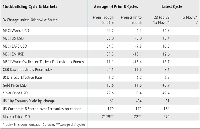
The current cycle has so far largely conformed to the historical pattern, with strong performance of equities, cyclical sectors, precious metals and credit. The suggestion is that remaining upside potential is limited in these areas, with weakness likely over the next 1-2 years as a cycle downswing unfolds.
Could the current cycle prove to be longer than average, extending the risk-on phase? A longer cycle is plausible both because the previous one was short (2.75 years) and to align with the business investment cycle, for which the dating here implies a low in 2027 or later.
A delayed entry to the downswing phase could imply catch-up potential for areas that have lagged relative to history, including non-US / EM equities and commodities.
Cycle timings, however, could be affected by accelerated stockbuilding in anticipation of tariff wars, which could bring forward the cycle peak, although this would not necessarily imply an earlier trough.
The overall message is cautionary. A previous post argued that the “excess” money backdrop for markets is now neutral / negative in stock as well as flow terms. Cyclical considerations reinforce the monetary message.