The historical Fed would be shifting to a tightening bias in response to recent economic news, according to a simple model.

To recap, the model classifies the Fed as being in tightening or easing mode depending on whether a probability estimate is above or below 0.5. The estimate is based on currently reported and lagged values of annual core PCE inflation, the unemployment rate and the ISM manufacturing delivery delays index. Despite the small number of inputs, the model does a satisfactory job of “explaining” the Fed’s past actions.

The model reading moved below 0.5 in August ahead of the September / October rate cuts, falling further in December, when the Fed delivered another reduction while signalling an expectation of additional moves in 2026 – see chart 1.

Chart 1

US Fed Funds Rate & Fed Policy Direction Probability Indicator

The reading, however, rebounded to around neutral in January and has climbed above 0.7 in February. The turnaround has been driven by a combination of a fall in the unemployment rate from 4.54% in November to 4.28% in January, a rebound in the ISM deliveries index from a November low and slightly firmer annual core PCE inflation (3.0% in December).

Additional data points for all three series will be available before the March FOMC meeting.

The January model shift is consistent with minutes of last month’s meeting, showing a strong consensus in favour of a hold with “several” participants viewing interest rate risks as two-sided.

US demand deposits surged by 17% between October and December. A previous post argued that this was likely to reflect a reporting change, rather than a flow of money between accounts. The Fed’s Public Affairs office has confirmed this interpretation in response to a query:

“The large swings in demand deposits and other liquid deposits in November and December 2025 on the H.6 were due to a reclassification of deposits.”

The reclassification has not affected the official M1 and M2 aggregates, which include both deposit categories. It has, however, distorted the M1A measure tracked here – comprising currency in circulation and demand deposits – as well as narrow money indicators constructed by other analysts.

The procedure adopted here has been to “correct” the M1A numbers by assuming that growth of demand deposits in November and December would have equalled that of total liquid deposits in the absence of the distortion. Chart 1 compares annual growth rates of the unadjusted and adjusted series.

Chart 1

110226c1

Claims have been circulating that US narrow money growth surged into end-2025, feeding narratives of excess liquidity and dollar debasement. Such claims appear not to account for the deposit data distortion and should be discounted.

US narrow money is growing slowly, casting doubt on expectations of economic strength. Broad money growth is faster but still within a normal range (and has been less informative about near-term economic prospects historically).

December numbers support the contention in a previous post that the Fed series for demand deposits has been distorted by the inclusion in mid-November of accounts previously classified as savings deposits. Weekly figures show a large jump over two weeks*, with a corresponding drop in “other liquid deposits”, which includes savings deposits. Demand deposits have since returned to weak expansion – see chart 1.

Chart 1

280126c1

The distortion has affected the M1A narrow money measure calculated here, comprising currency in circulation and demand deposits. Similar reclassifications appear to have occurred in several months over 2020-22, following removal of reserve requirements in March 2020, which effectively equalised the treatment of demand and savings deposits. The procedure adopted then was to assume that monthly growth of demand deposits would have matched that of total liquid deposits in the absence of the distortion.

Applying the same adjustment now suggests “true” six-month growth of M1A of 3.8% annualised in December, down from 5.3% in November. This is very similar to growth rates of the official M1 and M2 measures, as well as currency in circulation (3.9%, 4.3% and 3.9% respectively) – chart 2.

Chart 2

280126c2i

A broader “M2+” aggregate rose by 6.2% annualised over the same period, reflecting strong expansion of institutional money funds. (Official M2 includes retail but not institutional money funds.) Still, this growth rate is within an acceptable range of a suggested 5% pa “target” – the average over 2015-19, a period of moderate economic growth and inflation quiescence.

*The inclusion would have occurred on a single day but weekly numbers are averages, so the impact of a mid-week change would be spread over two weeks.

A measure of US broad money M3 derived from data in the Fed’s quarterly financial accounts grew at a 5.5% annualised rate in the two quarters to end-September. This exactly equals the average over the non-inflationary five years to end-2019 – see chart 1.

Chart 1

160126c1

The growth rate is also close to a 5.4% six-month annualised increase in the monthly M2+ measure calculated here. M2+ adds large time deposits and institutional money funds to official M2. M3 additionally includes repos.

M2+ growth rose to 6.7% in November, with available information suggesting a further increase in December. This could signal a future rise in inflation, though probably not before H2 2027. However, a similar pick-up a year ago reversed in H1 2025.

An advantage of the financial accounts measure is that a sectoral breakdown is available. M3 holdings of the household and non-financial business sectors rose at similar rates in the two quarters to September (5.2% and 5.0% annualised respectively), with stronger growth (12.7%) in financial sector money (i.e. held by insurance companies, pension funds and GSEs) – chart 2.

Chart 2

160126c2i

While household broad money continues to grow respectably, it has lagged far behind financial wealth. Money accounted for 14.0% of total financial assets at end-September, the lowest share since Q2 2019 – chart 3.

Chart 3

160126c3

The equity share of financial wealth, meanwhile, reached another post-WW2 record of 47.1%.

The fall in the broad money share since 2022 has been driven by time and savings deposits, with the combined weighting of currency, checkable deposits and money funds stable – chart 4.

Chart 4

160126c4

A chart recently doing the rounds shows only the latter measure (i.e. excluding time and savings deposits) to support a claim that household cash levels are high. Such selective use of data is regrettable.

(Note that the share of time and savings deposits has also been reduced by the reclassification of some savings deposits as demand – i.e. checkable – deposits.)

The rise in the equity share mostly reflects price appreciation but households have also been buying into strength.

The rally from the October 2022 low was initially driven by corporate demand but this fell off after H1 2024, with household and foreign purchases taking up the slack – chart 5.

Chart 5

160126c5

The broad money share reached a similar level before the GFC bear market and corrections in 2015 and 2018, as well as the 2020 covid sell-off.

The share fell below the current level in the late 1990s but equity exposure was then significantly lower, peaking at 38.7%. Put differently, the higher beta of the balance sheet now makes a similar cash undershoot less likely.

A sharp rise in US demand deposits in November probably reflects a statistical distortion. Monetary trends overall remain consistent with moderate nominal economic expansion.

The narrow money measure tracked here – M1A, comprising currency and demand deposits – jumped by 6.8% in November, pushing six-month growth up to 19.9% annualised from 5.4% in October – see chart 1.

Chart 1

291225c1

This surge, if genuine, would suggest a significant pick-up in economic growth during H1 2026, with associated upward pressure on interest rates.

The assessment here, however, is that the November jump likely reflects a statistical distortion cause by a bank or banks reclassifying savings deposits as demand deposits on the FR2900 reporting form.

Weekly unadjusted data show a large rise in demand deposits in the third and fourth weeks of November, with a corresponding drop in “other liquid deposits”, which include savings deposits – chart 2.

Chart 2

291225c2

The weekly numbers are averages of daily figures. The hypothesis of a reclassification is consistent with the demand deposit increase being spread over two weeks of data, assuming that the day of the change was after the start of the first week, resulting in a carry-over to the average for the following week.

A genuine surge in demand deposits would be expected to play out over multiple weeks. The change in the latest week – ending 1 December – returned to “normal”. Data for the remainder of December will be important for confirming the reclassification hypothesis.

Similar reclassifications appear to have occurred in several months over 2020-22, following removal of reserve requirements in March 2020, which effectively equalised the treatment of demand and savings deposits. The procedure adopted then was to assume that monthly growth of demand deposits would have matched that of total liquid deposits in the absence of the distortion.

Applying the same adjustment now suggests “true” six-month growth of M1A in November of 5.3% annualised, little changed from October.

The official M1 and M2 aggregates, as well as the broader M2+ measure calculated here, include savings deposits so are unaffected by such reclassifications. Six-month growth rates of the three measures were 4.1%, 4.6% and 6.7% annualised respectively in November – chart 1.

These growth rates are in a range consistent with trend economic expansion and inflation around the 2% target. Current money trends, in other words, give no strong grounds for monetary policy changes in either direction.

Credit tightening in private markets may mark the end of a boom in US bank lending to shadow banks, with negative monetary implications.

Equity prices of major players in private credit have fallen sharply in the wake of the Tricolor / First Brands bankruptcies, with an average down by 31% from a January peak – see chart 1.

Chart 1

141025c1

Increased risk aversion is also evident in lower prices / higher yields of traded private credit instruments, such as the VanEck Business Development Companies ETF (BIZD), which usually mirrors moves in high yield spreads but has opened up a wide gap – chart 2.

Chart 2

141025c2

Commercial bank lending to shadow banks / private credit has been booming, with the “all other” category containing loans to non-bank financial institutions up by 14.5% in the year to September, accounting for 2.9 pp of overall bank loan growth of 4.9% – chart 3*.

Chart 3

141025c3

Traditional loan categories – C&I, real estate and consumer – grew by only 2.5% over the same period.

Lending to shadow banks is likely to slow as private credit players rein in activity and loan officers tighten standards. A normalisation could cut 2 pp or more from annual loan growth, implying weaker broad money expansion unless offset by other “credit counterparts”**.

Credit tightening could extend to other loan categories unless private markets recover – chart 4. (Note that the reporting window for the October Fed senior loan officer survey, to be released in early November, may already have closed, so the results may not fully reflect recent developments.)

Chart 4

141025c4

*Growth numbers are break-adjusted – levels series have been distorted by recent reporting changes.

**Some combination of increased monetary deficit financing, a stronger basic balance of payments or reduced non-deposit funding.

A simple model of the Fed’s historical behaviour suggests that the window for rate cuts will close in early 2026 if the economy evolves in line with the median FOMC forecast.

The model classifies the Fed as being in tightening or easing mode depending on whether a probability estimate is above or below 0.5. The estimate is based on currently reported and lagged values of core PCE inflation, the unemployment rate and the ISM manufacturing delivery delays indicator. Despite the small number of inputs, the model does a satisfactory job of “explaining” the Fed’s past actions*.

The probability estimate rose above 0.5 in March, confirming that the Fed was no longer in easing mode. It moved back below that level in August / September ahead of last week’s rate cut – see chart 1.

Chart 1

240925c1i

The September reading of 0.44 would also have been consistent with a hold, suggesting that easing was partly precautionary and / or influenced by Trump administration pressure.

The median FOMC projections for 2026 have shifted hawkishly since June. Annual core PCE inflation is now 2.6% in Q4 2026 from 2.4% previously, while the unemployment rate declines from 4.5% to 4.4% between Q4 2025 and Q4 2026.

The model forecast shown in the chart is based on quarterly paths for core inflation and the jobless rate interpolated from the FOMC Q4 projections, along with an assumption that the ISM deliveries index stabilises at its August level.

The probability estimate edges back above 0.5 in October, returns to the easing zone over November-January but then embarks on a sustained rise above 0.5.

The shift into the tightening zone is unsurprising given the forecast of sustained above-target core inflation and a firming labour market.

The suggestion of a short window for further rate cuts is at odds with market expectations of an extended easing cycle. The market path presumably reflects a more dovish economic view but may also incorporate some probability of a change in the Fed’s reaction function under a new Chair.

*A previous post contained a chart showing a 60-year history.

The Kondratyev cycle describes a tendency for global inflation – or the price level in earlier centuries – to reach major peaks / troughs every 54 years on average.

The highest peaks in global inflation in the first and second halves of the last century occurred in 1919 and 1974 respectively, suggesting another peak in the late 2020s.

US-centric analysts often wrongly place the last peak in 1980, as US annual consumer price inflation reached a higher high in that year. This was not true of a GDP-weighted average of CPI inflation rates across major economies, nor of US producer price inflation, which also reached a maximum in 1974.

Cycle troughs typically occur about two-thirds of the way through the interval between peaks, i.e. about 36 years after one peak and 18 years before the next. The annual change in global / US consumer prices reached a low in negative territory in 2009, consistent with this pattern and further supporting the expectation of a late 2020s peak.

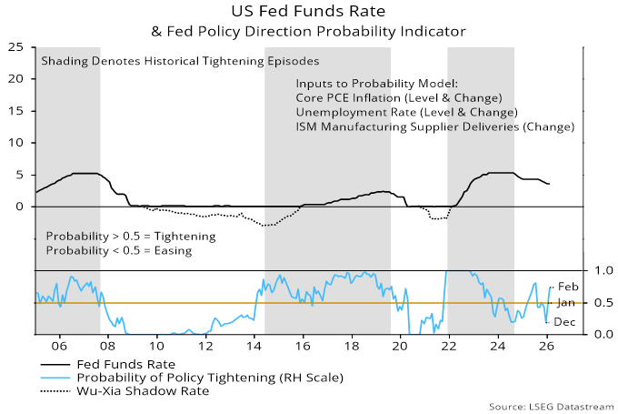
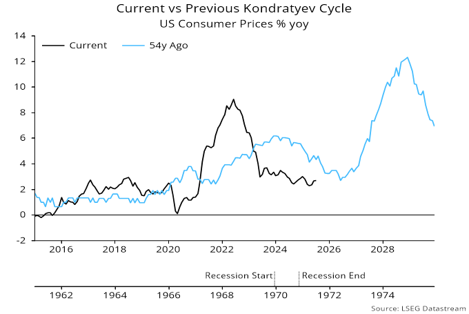
Numerous commentators have drawn a parallel between recent / current US inflation experience and the early 1970s. Annual CPI inflation reached a post-Korean war high in 1969, fell back into 1972, then embarked on a bigger climb into the 1974 peak. The suggestion is that the rise into 2022 is the analogue of the late 1960s increase and another, bigger upsurge will unfold in 2026-27 – see chart 1.

Chart 1

130825c1

Proponents of this view cite tariffs, large budget deficits and erosion of Fed independence as factors conducive to another inflation pick-up.

Current monetary trends, however, differ from the early 1970s, suggesting that such concerns are premature.

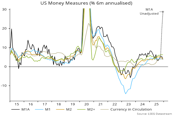
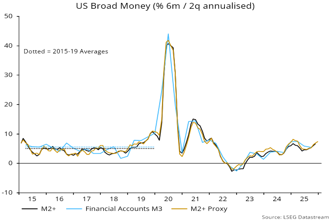
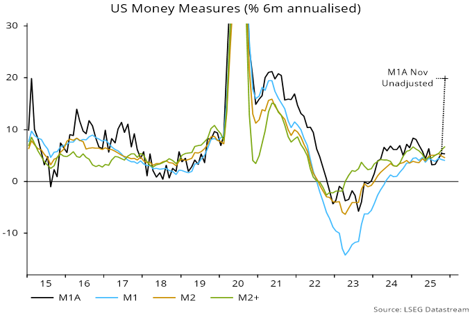
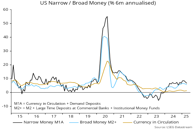
The 1967-69 inflation pick-up was preceded by a rise in annual broad money growth to above 10%. Fed rate hikes caused money growth to slump, pushing the economy into a recession in 1970. The Fed responded by fully reversing the increase in rates. Money growth surged into the mid-teens in 1971, laying the foundation for the 1972-74 inflation upswing – chart 2.

Chart 2

130825c2

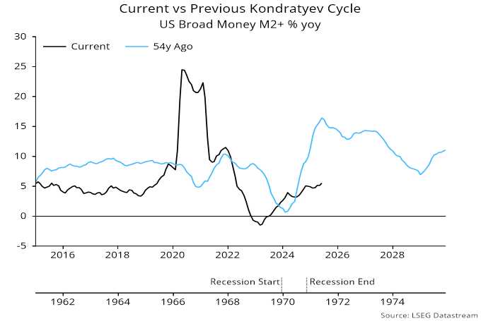
Fed tightening in 2022-23 also caused money growth to slump but the economy avoided a recession, resulting in a much more muted policy reversal. Money growth has recovered but only to a “normal” level by historical standards.

The monetary conditions for a second inflation rise into the Kondratyev peak, therefore, have yet to fall into place.

How could this change? One possibility is that lagged effects of policy tightening and tariff damage result in a recession and / or significant labour market weakness, triggering panic Fed easing that pushes money growth up further – a delayed 1970 scenario.

Alternatively, the Trump administration could wrest control of the Fed and push rates lower regardless of economic conditions.

A third possibility is that the Treasury increases monetary financing of the deficit, for example by relying on issuance of bills – mostly bought by banks and money funds – rather than notes and bonds.

The Kondratyev cycle is global so another scenario is that the monetary impulse for higher inflation comes from outside the US, for example through a combination of reflation in China and a further surge in already strong Indian money growth.

Large inflation swings, in either direction, often occur when policy-makers, and economic agents generally, are facing the “wrong” way (as was the case in 2020). The final ascent into the Kondratyev peak may require a recession / deflation scare first.

US money growth is slowing, suggesting less support for the economy and improving prospects for rate cuts.

Six-month growth of the preferred narrow and broad aggregates here fell to 6.6% and 5.6% annualised respectively in April, down from recent peaks of 8.6% and 6.7% – see chart 1.

Chart 1

300525c1

Chart 2 shows key influences on broad money expansion. Strength in late 2024 / early 2025 was driven by monetary deficit financing initiated by the Treasury (“Treasury QE”). The six-month running total of such financing, however, fell sharply in April, reflecting a recent reduction in the stock of Treasury bills coupled with a rebound last month in the Treasury’s cash balance at the Fed.

Chart 2

300525c2

Another significant contributor to the monetary slowdown has been a decline in commercial banks’ net external assets. Changes in such assets are the counterpart of the basic balance of payments position. This position has weakened as tariff front-running has boosted the trade deficit, while negative and chaotic policies have discouraged portfolio capital inflows.

Fed QT has remained a drag on broad money growth but the six-month impact is moderating, reflecting the April taper.

The monetary slowdown has also been mitigated by a pick-up in bank loan growth.

A consideration of prospects for these influences suggests that money growth will moderate further.

As previously discussed, the Treasury’s financing plans, based on a lifting of the debt ceiling, imply a sizeable negative impact in the six months to September as issuance resumes and the Treasury’s balance at the Fed is restored to its prior level – chart 3.

Chart 3

300525c3

The Fed could taper QT further to ease associated pressure on bank reserves but may not fully offset the Treasury drag.

The basic balance of payments may remain weak as foreign investors diversify away from US exposure.

The recent pick-up in bank loan growth, meanwhile, partly reflects tariff-related stockbuilding and may slow as this moderates. Acceleration was signalled by the Fed’s senior loan officer survey but corporate credit demand balances fell back in the latest (April) report.

US broad – and probably narrow – money growth has been boosted recently by reduced issuance of Treasuries due to the debt ceiling constraint. The accompanying enforced run-down of the Treasury’s cash balance at the Fed has resulted in a resurgence of “Treasury QE”, a proxy for monetary deficit financing. This has more than offset (reduced) Fed QT – see charts 1 and 2.

Chart 1

010525c1

Chart 2

010525c2

Conditional on an early lifting of the debt ceiling, however, the Treasury’s financing estimates imply a dramatic reversal over the remainder of Q2 / Q3. The plans involve “catch-up” issuance to restore the Treasury balance to its prior level, with coupon debt – rather than bills – bearing most of the burden. (Coupon sales to non-banks contract the broad money stock; bills are more likely to be purchased by money funds and banks, implying a neutral monetary influence.)

The Fed could neutralise most of the negative Treasury impact by suspending QT. Still, the joint Fed / Treasury influence would swing from being significantly expansionary to neutral or slightly contractionary.

The suggested loss of money momentum could be offset by other factors. A similar swing in the joint influence in Q2 / Q3 2024 was associated with a minor slowdown in broad money as it coincided with a pick-up in bank lending growth.

Will a rebound in issuance put upward pressure on Treasury yields? Over 2010-19, Fed QE / QT – and the joint Fed / Treasury influence – was positively correlated (weakly) with the 10-year yield, i.e. the yield tended to rise when the Fed absorbed more supply and fall when it wound down purchases or ran down holdings.

A possible explanation is that the impact of the Fed’s actions on monetary trends and thereby economic prospects outweighed the direct yield impact of reduced or increased Treasury supply to the market. The suggested negative swing in the joint Fed / Treasury influence, therefore, could be associated with lower not higher yields.