Credit tightening in private markets may mark the end of a boom in US bank lending to shadow banks, with negative monetary implications.

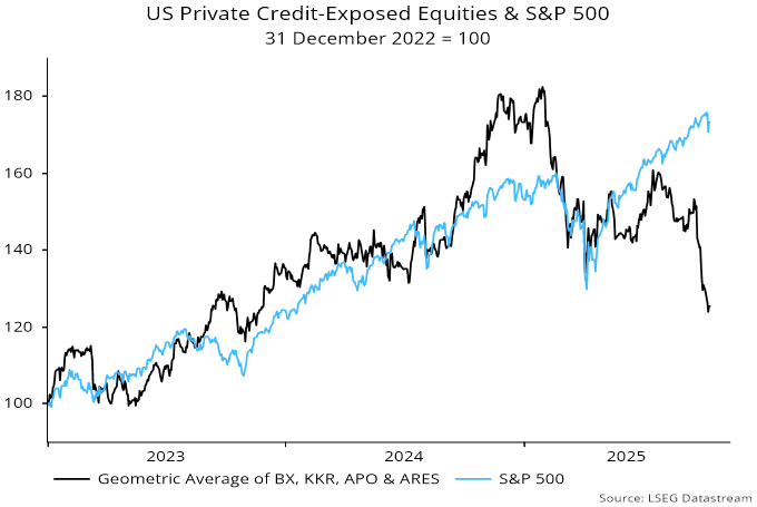
Equity prices of major players in private credit have fallen sharply in the wake of the Tricolor / First Brands bankruptcies, with an average down by 31% from a January peak – see chart 1.

Chart 1

Chart 1 showing US Private Credit-Exposed Equities & S&P 500 31 December 2022 = 100

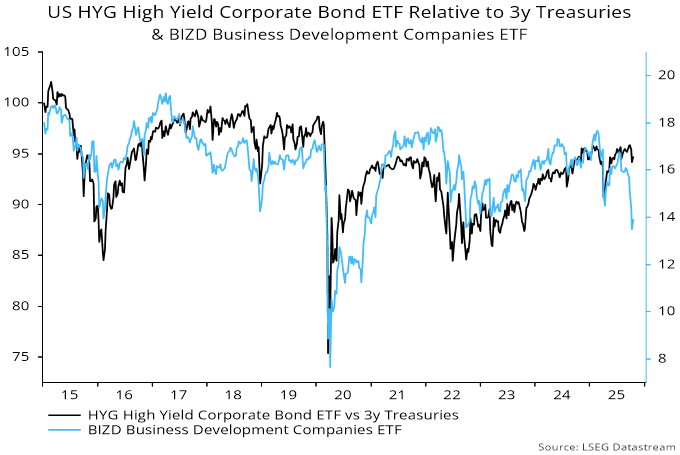
Increased risk aversion is also evident in lower prices / higher yields of traded private credit instruments, such as the VanEck Business Development Companies ETF (BIZD), which usually mirrors moves in high yield spreads but has opened up a wide gap – chart 2.

Chart 2

Chart 2 showing US HYG High Yield Corporate Bond ETF Relative to 3y Treasuries & BIZD Business Development Companies ETF

Commercial bank lending to shadow banks / private credit has been booming, with the “all other” category containing loans to non-bank financial institutions up by 14.5% in the year to September, accounting for 2.9 pp of overall bank loan growth of 4.9% – chart 3*.

Chart 3

Chart 3 showing US Commercial Bank Loans & Leases (% yoy)

Traditional loan categories – C&I, real estate and consumer – grew by only 2.5% over the same period.

Lending to shadow banks is likely to slow as private credit players rein in activity and loan officers tighten standards. A normalisation could cut 2 pp or more from annual loan growth, implying weaker broad money expansion unless offset by other “credit counterparts”**.

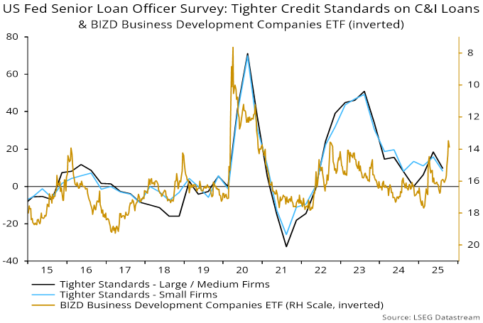
Credit tightening could extend to other loan categories unless private markets recover – chart 4. (Note that the reporting window for the October Fed senior loan officer survey, to be released in early November, may already have closed, so the results may not fully reflect recent developments.)

Chart 4

Chart 4 showing US Fed Senior Loan Officer Survey: Tighter Credit Standards on C&I Loans & BIZD Business Development Companies ETF (inverted)

*Growth numbers are break-adjusted – levels series have been distorted by recent reporting changes.

**Some combination of increased monetary deficit financing, a stronger basic balance of payments or reduced non-deposit funding.

A simple model of the Fed’s historical behaviour suggests that the window for rate cuts will close in early 2026 if the economy evolves in line with the median FOMC forecast.

The model classifies the Fed as being in tightening or easing mode depending on whether a probability estimate is above or below 0.5. The estimate is based on currently reported and lagged values of core PCE inflation, the unemployment rate and the ISM manufacturing delivery delays indicator. Despite the small number of inputs, the model does a satisfactory job of “explaining” the Fed’s past actions*.

The probability estimate rose above 0.5 in March, confirming that the Fed was no longer in easing mode. It moved back below that level in August / September ahead of last week’s rate cut – see chart 1.

Chart 1

Chart 1 showing US Fed Funds Rate & Fed Policy Direction Probability Indicator

The September reading of 0.44 would also have been consistent with a hold, suggesting that easing was partly precautionary and / or influenced by Trump administration pressure.

The median FOMC projections for 2026 have shifted hawkishly since June. Annual core PCE inflation is now 2.6% in Q4 2026 from 2.4% previously, while the unemployment rate declines from 4.5% to 4.4% between Q4 2025 and Q4 2026.

The model forecast shown in the chart is based on quarterly paths for core inflation and the jobless rate interpolated from the FOMC Q4 projections, along with an assumption that the ISM deliveries index stabilises at its August level.

The probability estimate edges back above 0.5 in October, returns to the easing zone over November-January but then embarks on a sustained rise above 0.5.

The shift into the tightening zone is unsurprising given the forecast of sustained above-target core inflation and a firming labour market.

The suggestion of a short window for further rate cuts is at odds with market expectations of an extended easing cycle. The market path presumably reflects a more dovish economic view but may also incorporate some probability of a change in the Fed’s reaction function under a new Chair.

*A previous post contained a chart showing a 60-year history.

The Kondratyev cycle describes a tendency for global inflation – or the price level in earlier centuries – to reach major peaks / troughs every 54 years on average.

The highest peaks in global inflation in the first and second halves of the last century occurred in 1919 and 1974 respectively, suggesting another peak in the late 2020s.

US-centric analysts often wrongly place the last peak in 1980, as US annual consumer price inflation reached a higher high in that year. This was not true of a GDP-weighted average of CPI inflation rates across major economies, nor of US producer price inflation, which also reached a maximum in 1974.

Cycle troughs typically occur about two-thirds of the way through the interval between peaks, i.e. about 36 years after one peak and 18 years before the next. The annual change in global / US consumer prices reached a low in negative territory in 2009, consistent with this pattern and further supporting the expectation of a late 2020s peak.

Numerous commentators have drawn a parallel between recent / current US inflation experience and the early 1970s. Annual CPI inflation reached a post-Korean war high in 1969, fell back into 1972, then embarked on a bigger climb into the 1974 peak. The suggestion is that the rise into 2022 is the analogue of the late 1960s increase and another, bigger upsurge will unfold in 2026-27 – see chart 1.

Chart 1

Chart 1 showing Current vs Previous Kondratyev Cycle
US Consumer Prices % yoy

Proponents of this view cite tariffs, large budget deficits and erosion of Fed independence as factors conducive to another inflation pick-up.

Current monetary trends, however, differ from the early 1970s, suggesting that such concerns are premature.

The 1967-69 inflation pick-up was preceded by a rise in annual broad money growth to above 10%. Fed rate hikes caused money growth to slump, pushing the economy into a recession in 1970. The Fed responded by fully reversing the increase in rates. Money growth surged into the mid-teens in 1971, laying the foundation for the 1972-74 inflation upswing – chart 2.

Chart 2

Chart 2 showing Current vs Previous Kondratyev Cycle
US Broad Money M2+ % yoy

Fed tightening in 2022-23 also caused money growth to slump but the economy avoided a recession, resulting in a much more muted policy reversal. Money growth has recovered but only to a “normal” level by historical standards.

The monetary conditions for a second inflation rise into the Kondratyev peak, therefore, have yet to fall into place.

How could this change? One possibility is that lagged effects of policy tightening and tariff damage result in a recession and / or significant labour market weakness, triggering panic Fed easing that pushes money growth up further – a delayed 1970 scenario.

Alternatively, the Trump administration could wrest control of the Fed and push rates lower regardless of economic conditions.

A third possibility is that the Treasury increases monetary financing of the deficit, for example by relying on issuance of bills – mostly bought by banks and money funds – rather than notes and bonds.

The Kondratyev cycle is global so another scenario is that the monetary impulse for higher inflation comes from outside the US, for example through a combination of reflation in China and a further surge in already strong Indian money growth.

Large inflation swings, in either direction, often occur when policy-makers, and economic agents generally, are facing the “wrong” way (as was the case in 2020). The final ascent into the Kondratyev peak may require a recession / deflation scare first.

US money growth is slowing, suggesting less support for the economy and improving prospects for rate cuts.

Six-month growth of the preferred narrow and broad aggregates here fell to 6.6% and 5.6% annualised respectively in April, down from recent peaks of 8.6% and 6.7% – see chart 1.

Chart 1

Chart 1 showing US Narrow/Broad Money

Chart 2 shows key influences on broad money expansion. Strength in late 2024 / early 2025 was driven by monetary deficit financing initiated by the Treasury (“Treasury QE”). The six-month running total of such financing, however, fell sharply in April, reflecting a recent reduction in the stock of Treasury bills coupled with a rebound last month in the Treasury’s cash balance at the Fed.

Chart 2

Chart 2 showing US Broad Money M2+ and Key Influences

Another significant contributor to the monetary slowdown has been a decline in commercial banks’ net external assets. Changes in such assets are the counterpart of the basic balance of payments position. This position has weakened as tariff front-running has boosted the trade deficit, while negative and chaotic policies have discouraged portfolio capital inflows.

Fed QT has remained a drag on broad money growth but the six-month impact is moderating, reflecting the April taper.

The monetary slowdown has also been mitigated by a pick-up in bank loan growth.

A consideration of prospects for these influences suggests that money growth will moderate further.

As previously discussed, the Treasury’s financing plans, based on a lifting of the debt ceiling, imply a sizeable negative impact in the six months to September as issuance resumes and the Treasury’s balance at the Fed is restored to its prior level – chart 3.

Chart 3

Chart 3 showing US Broad Money M2+ and Fed/Treasury QE/QT

The Fed could taper QT further to ease associated pressure on bank reserves but may not fully offset the Treasury drag.

The basic balance of payments may remain weak as foreign investors diversify away from US exposure.

The recent pick-up in bank loan growth, meanwhile, partly reflects tariff-related stockbuilding and may slow as this moderates. Acceleration was signalled by the Fed’s senior loan officer survey but corporate credit demand balances fell back in the latest (April) report.

US broad – and probably narrow – money growth has been boosted recently by reduced issuance of Treasuries due to the debt ceiling constraint. The accompanying enforced run-down of the Treasury’s cash balance at the Fed has resulted in a resurgence of “Treasury QE”, a proxy for monetary deficit financing. This has more than offset (reduced) Fed QT – see charts 1 and 2.

Chart 1

Chart 1 showing US Broad Money M2+ (6m change, $ bn) & Fed / Treasury QE / QT (6m sum, $ bn)

Chart 2

Chart 2 showing US Broad Money M2+ (6m change, $ bn) & Sum of Fed & Treasury QE / QT (6m sum, $ bn)

Conditional on an early lifting of the debt ceiling, however, the Treasury’s financing estimates imply a dramatic reversal over the remainder of Q2 / Q3. The plans involve “catch-up” issuance to restore the Treasury balance to its prior level, with coupon debt – rather than bills – bearing most of the burden. (Coupon sales to non-banks contract the broad money stock; bills are more likely to be purchased by money funds and banks, implying a neutral monetary influence.)

The Fed could neutralise most of the negative Treasury impact by suspending QT. Still, the joint Fed / Treasury influence would swing from being significantly expansionary to neutral or slightly contractionary.

The suggested loss of money momentum could be offset by other factors. A similar swing in the joint influence in Q2 / Q3 2024 was associated with a minor slowdown in broad money as it coincided with a pick-up in bank lending growth.

Will a rebound in issuance put upward pressure on Treasury yields? Over 2010-19, Fed QE / QT – and the joint Fed / Treasury influence – was positively correlated (weakly) with the 10-year yield, i.e. the yield tended to rise when the Fed absorbed more supply and fall when it wound down purchases or ran down holdings.

A possible explanation is that the impact of the Fed’s actions on monetary trends and thereby economic prospects outweighed the direct yield impact of reduced or increased Treasury supply to the market. The suggested negative swing in the joint Fed / Treasury influence, therefore, could be associated with lower not higher yields.

A cyclical forecasting framework implies that current economic events will contain echoes of developments at the same stage of previous cycles.

Similarities should be more pronounced at around 18- and particularly 54-year frequencies, corresponding to average lengths of the housing and Kondratyev inflation cycles respectively.

A previous post noted the similarity of Fed tightening episodes in 1967-69 and 2022-23. The Fed funds rate (month average) rose from peak to trough by 540 bp and 530 bp respectively, topping in August 1969 and August 2023, exactly 54 years later – see chart 1.

Chart 1

Current vs previous Kondratyev Cycle. US Fed funds rate.

The US economy entered a recession at the end of 1969. GDP was recovering by Q2 1970 but suffered a second hit from a prolonged auto strike.

The Fed cut rates much more aggressively than recently but reversed course temporarily from early 1971 as the economy rebounded strongly and inflation remained high. The current Fed pause has occurred at the same cycle time.

Inflation fell sharply into 1972, mirroring a big slowdown in broad money growth two years earlier. The Fed resumed easing later in 1971, with the funds rate reaching an ultimate low in February 1972.

A possible scenario is that President Trump’s tariff shock triggers the recession “missing” from the current cycle, causing the Fed to ease aggressively later in 2025, with rates and inflation falling to lows in 2026 corresponding to those reached in 1972.

US disruption to global economic relations is itself is strongly reminiscent of policy developments 54 years ago. In August 1971, President Nixon shocked trading partners by suspending convertibility of the dollar into gold within the Bretton Woods system while imposing a 10% tariff on imports.

The backdrop was a US balance of payments deficit and an accelerating loss of gold from US reserves. According to a Federal Reserve history of the period, President Nixon blamed the deficit “on unfair trading practices and other countries’ unwillingness to share the military burden of the Cold War”. Sound familiar?

The “Nixon shock” triggered a crisis, with global policy-makers fearing that “international monetary relations would collapse amid the uncertainty about exchange rates, the imminent spread of protectionism, and the looming prospects of a serious recession”.

The crisis was resolved, at least temporarily, by the December 1971 Smithsonian Agreement, involving trading partners agreeing to revalue their currencies against the dollar in return for the removal of tariffs. “The net effect was roughly a 10.7 percent average devaluation of the dollar against the other key currencies … Foreign nations also agreed to comply with Nixon’s request to lessen existing trade restrictions and to assume a greater share of the military burden.”

Could a revaluation of currencies against the dollar be part of a “deal” to end the current crisis, once President Trump comes to recognise that the economic costs of his high tariff policy greatly exceed any benefits?

The Nixon shock occurred with the real trade-weighted value of the dollar at a similar premium to its long-run average to today. The shock accelerated a secular decline into and beyond the following housing cycle trough – chart 2.

Chart 2

Real US dollar index vs advanced foreign economies. Based on consumer prices, January 2006 = 100, Source: Federal Reserve / BIS.

The Fed’s economic forecasts are inconsistent with the suggestion of a 50 bp cut in rates by year-end, according to a model of its historical behaviour.

The model assesses the probability of the Fed being in tightening or easing mode in a particular month based on currently reported and lagged values of core PCE inflation, the unemployment rate and the ISM manufacturing delivery delays indicator. Despite the small number of inputs, the model does a satisfactory job of “explaining” the Fed’s past actions – see chart 1.

Chart 1

Chart 1 showing US Fed Funds Rate & Fed Policy Direction Probability Indicator 
The model assesses the probability of the Fed being in tightening or easing mode in a particular month based on currently reported and lagged values of core PCE inflation, the unemployment rate and the ISM manufacturing delivery delays indicator. Despite the small number of inputs, the model does a satisfactory job of “explaining” the Fed’s past actions.

The model predicted that the Fed would hold in March with a slight tightening bias – the probability reading rose to just above the 0.5 neutral level, having previously been in the easing zone.

The FOMC median projections for core PCE inflation and the unemployment rate in Q4 2025 were raised to 2.8% and 4.4% respectively this month, from 2.5% and 4.3% in December. Assuming a smooth progression to these values, the model signals a greater chance of tightening than easing over the remainder of the year – chart 2.

Chart 2

Chart 2 showing US Fed Funds Rate & Fed Policy Direction Probability Indicator 
The FOMC median projections for core PCE inflation and the unemployment rate in Q4 2025 were raised to 2.8% and 4.4% respectively this month, from 2.5% and 4.3% in December. Assuming a smooth progression to these values, the model signals a greater chance of tightening than easing over the remainder of the year.

The suggestion is that inflation and / or labour markets news will need to surprise significantly to the downside to warrant the 50 bp cut in rates by year-end implied by the median dot.

Chart 3 shows the model prediction in an alternative scenario in which the unemployment rate and core inflation move to 4.7% and 2.5% in Q4. The probability reading remains above 0.5 into the summer but falls back into the easing zone at end-Q3.

Chart 3

Chart 3 showing US Fed Funds Rate & Fed Policy Direction Probability Indicator 
Chart 3 shows the model prediction in an alternative scenario in which the unemployment rate and core inflation move to 4.7% and 2.5% in Q4. The probability reading remains above 0.5 into the summer but falls back into the easing zone at end-Q3.

The Fed’s projection of a 4.4% unemployment rate in Q4 implies only a 0.17 pp rise relative to a recent (November) high. An indicator of labour market weakness from the Conference Board consumer survey rose further in March and is almost back to its January 2021 level, when the jobless rate excluding temporarily laid-off workers was more than 1 pp higher than now – chart 4.

Chart 4

Chart 4 showing US Unemployment Rate ex Temporary Layoffs & Conference Board Consumer Survey Labour Market Weakness Indicator* *Average of Current & Future Job Scarcity Balances

The US economy and markets previously enjoyed a tailwind from an “excess” stock of money relative to prevailing levels of nominal spending and asset prices. A post in December argued that nominal economic growth and rising markets had eliminated this excess by mid-2024, with a small monetary shortfall opening up Q3. An updated analysis suggests that recent weakness in equities has been insufficient to restore a surplus.

To recap, the “quantity theory of wealth”, explained in posts in 2020, is a suggested modification of the traditional quantity theory recognising that (broad) money demand depends on (gross) wealth as well as income and proposing equal elasticities. Nominal income Y is replaced on the right-hand side of the equation of exchange MV = PY by a geometric mean of income and wealth.

Chart 1 applies the “theory” to US data since end-2014. Nominal GDP is used as the measure of income, with wealth defined as the sum of market values of public equities, debt securities (excluding Fed holdings) and the housing stock.

Chart 1

Chart 1 showing US Broad Money, Nominal GDP & Gross Wealth* Q4 2014 = 100 *Gross Wealth = Public Equities + Debt Securities ex Fed + Residential Real Estate

The combined income / wealth variable closely tracked moderate growth of broad money over 2015-19. Wealth rose faster than income, so traditionally-defined velocity fell. The velocity of the combined income / wealth measure was stable.

Policy easing following the covid shock resulted in possibly unprecedented monetary disequilibrium. Asset prices responded swiftly to the excess, causing wealth to overshoot broad money in 2021 before a sharp correction in 2022.

The combined income / wealth measure was still well below the level implied by broad money even before this set-back. Deployment of excess money fuelled a second surge in wealth from late 2022 while sustaining economic growth despite monetary policy tightening.

Asset price gains, goods / services inflation and real economic expansion resulted in the income / wealth measure finally catching up with broad money in mid-2024, with a small overshoot emerging in Q3. The velocity of the combined measure, in other words, had fully reversed its pandemic fall.

Asset stock numbers in the Q4 financial accounts released last week allow the calculation to be updated to end-2024. Broad money grew slightly faster than the combined income / wealth measure in Q4 but not by enough to close the end-Q3 gap.

Has the recent equity market correction pushed the combined measure back below the level implied by the money stock? Available information suggests not: ongoing growth in the stock of debt securities along with rising goods / services prices may have offset the decline in equities – unless the economy turns out to have contracted in Q1. Broad money, meanwhile, grew modestly in January, with a February number released next week.

The previous monetary excess imparted a positive skew to the economy / markets so its withdrawal suggests greater vulnerability to negative developments.

US / Eurozone January money numbers suggest that US policy chaos is damaging economic prospects.

The narrow money measures followed here – US M1A and Eurozone non-financial M1 – were unchanged and fell on the month respectively. Narrow money weakness can reflect reduced confidence and spending intentions.

US six-month real narrow money momentum fell between August and October, partially recovered into year-end but has now returned to the October level – see chart 1. The slowdown since August signalled recent softer economic data – see previous post.

Chart 1

Chart 1 showing Real Narrow Money (% 6m)

A recovery in Eurozone six-month real narrow money momentum stalled in December / January but the gap with the US has narrowed significantly since August, suggesting better relative performance.

US narrow money momentum may weaken further. Policy chaos may cause spending to be deferred, reducing demand for transactions money.

The Fed has gone on hold with rates judged still to be in restrictive territory. The ECB has cut by more, is still in easing mode and may be closer to “neutral”.

A further consideration noted previously is that US narrow money growth has tended to rise into presidential elections but reverse shortly before or after the poll date – chart 2. (1984 and 2000 were notable exceptions.)

Chart 2

Chart 2 showing US Narrow Money (% 6m annualised)

Sectoral numbers show that recent US money growth has been focused on the household and financial sectors, with business holdings falling.

A recent post noted that US six-month narrow money momentum fell back in September / October, casting doubt on post-election economic optimism. Sectoral money trends revealed in the Fed’s Q3 financial accounts give further grounds for caution.

Chart 1 compares the six-month rate of change of the monthly broad measure calculated here – M2+, which adds large time deposits at commercial banks and institutional money funds to the official M2 series – with the two-quarter change in a domestic money aggregate derived from the financial accounts. The series are closely correlated with end-Q3 readings similar.

Chart 1

Chart 1 showing US Broad Money (% 6m / 2q annualised)

An advantage of the financial accounts data set is that it allows a breakdown of broad / narrow money between the household, non-financial business and financial sectors. Broad money growth in the two quarters to end-Q3 was driven by households and financial firms, with business money falling – chart 2. The narrow money decomposition (not shown) mirrors this pattern.

Chart 2

Chart 2 showing US Broad Money Holdings by Sector (% 2q annualised)

Business money trends have exhibited a stronger and more consistent relationship with future economic activity than household / financial sector developments historically. Changes in business liquidity can influence decisions about investment and hiring, with employment consequences feeding through to household incomes and money holdings.

The approach here, therefore, is to interpret the signal from a given level of aggregate money growth as more positive – or less negative – when the business component is outperforming (and vice versa).

Chart 3 shows that real business money – on both broad and narrow definitions – is falling on a year-ago basis, suggesting that a slowdown in investment will continue in 2025.

Chart 3

Chart 3 showing US Business Investment & Real Non-Financial Business Money (% yoy)

The Q3 financial accounts numbers also support an earlier proposition here that asset prices and nominal GDP have – in combination – moved above levels implied by the current broad money stock, i.e. there is no longer an “excess” money tailwind for the economy and markets.

To recap, the “quantity theory of wealth” is a suggested modification of the traditional quantity theory recognising that (broad) money demand depends on wealth as well as income and proposing equal elasticities. Nominal income is replaced on the right-hand side of the equation of exchange MV = PY by a geometric mean of income and wealth.

Using Q4 2014 as a base, the measure of gross wealth used here – the market value of public equities, debt securities (excluding Fed holdings) and the housing stock – had risen by 107% as of end-Q3 versus a 64% increase in nominal GDP. Implied growth of 84% in the geometric average compares with an increase of 80% in broad money over the same period – chart 4.

Chart 4

Chart 4 showing US Broad Money, Nominal GDP & Gross Wealth* Q4 2014 = 100 *Gross Wealth = Public Equities + Debt Securities ex Fed + Residential Real Estate

Equity / house price gains, debt issuance / QT and expected respectable nominal GDP expansion suggest that the overshoot will have widened in Q4.